CASE STUDIES
NASA WEBSITE REDESIGN
Redesigning the website and branding for the iconic forerunner is space aviation.
Role:
UX
Visual Design
Context:
Personal
Tools:
Sketch
Intro
With the recent presidential election, many of our favorite government programs have undergone serious budget cuts.
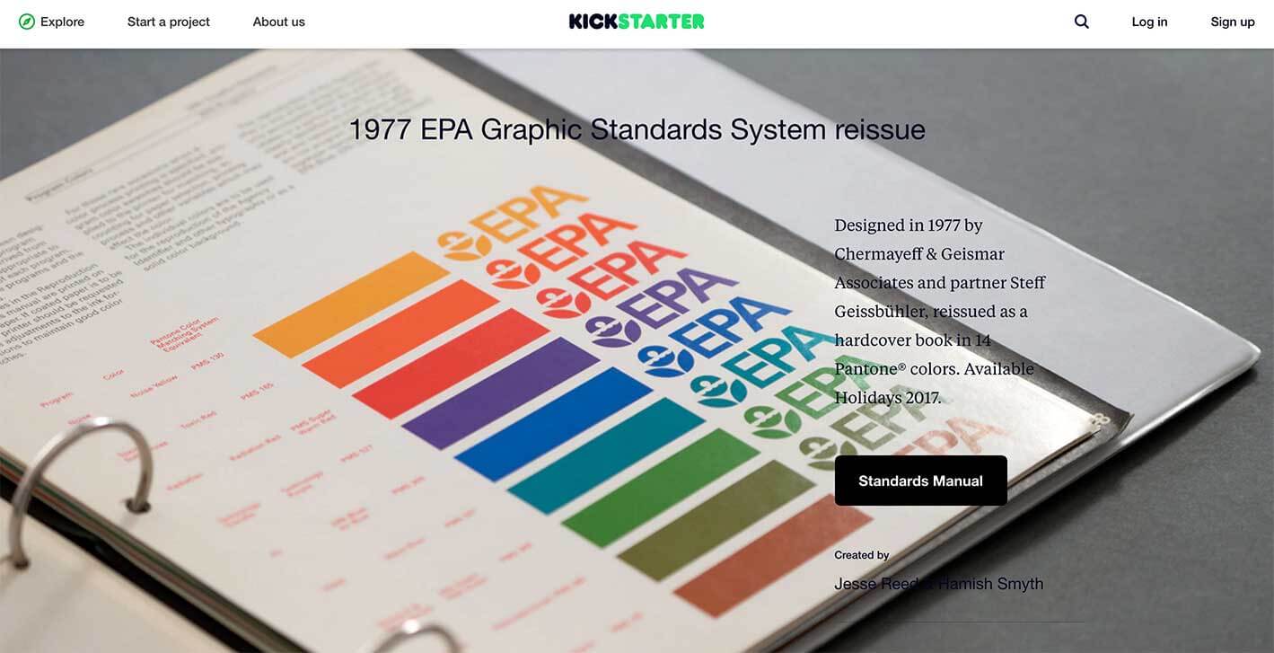
The Environmental Protection agency, to this day, has been a forerunner in quality design and implementation with many admirers turning to Kickstarter reproductions of their once iconic brand guidelines.
Background
As of late, these programs have suffered despite the recent resurgence of space exploration spurred by private corporations including Boeing and SpaceX.
There’s been plenty of technology development in the last few years, especially in regards to alternative fuels, colonization and space exploration. In a personal effort to create future interest in the history and future of space exploration, I decided to update the visual design of the current Nasa website to embody the once iconic brand etched in American history.
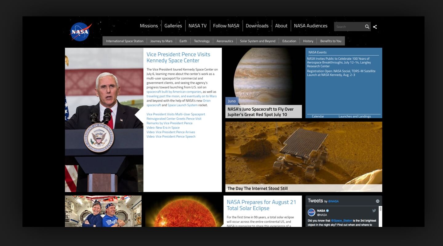
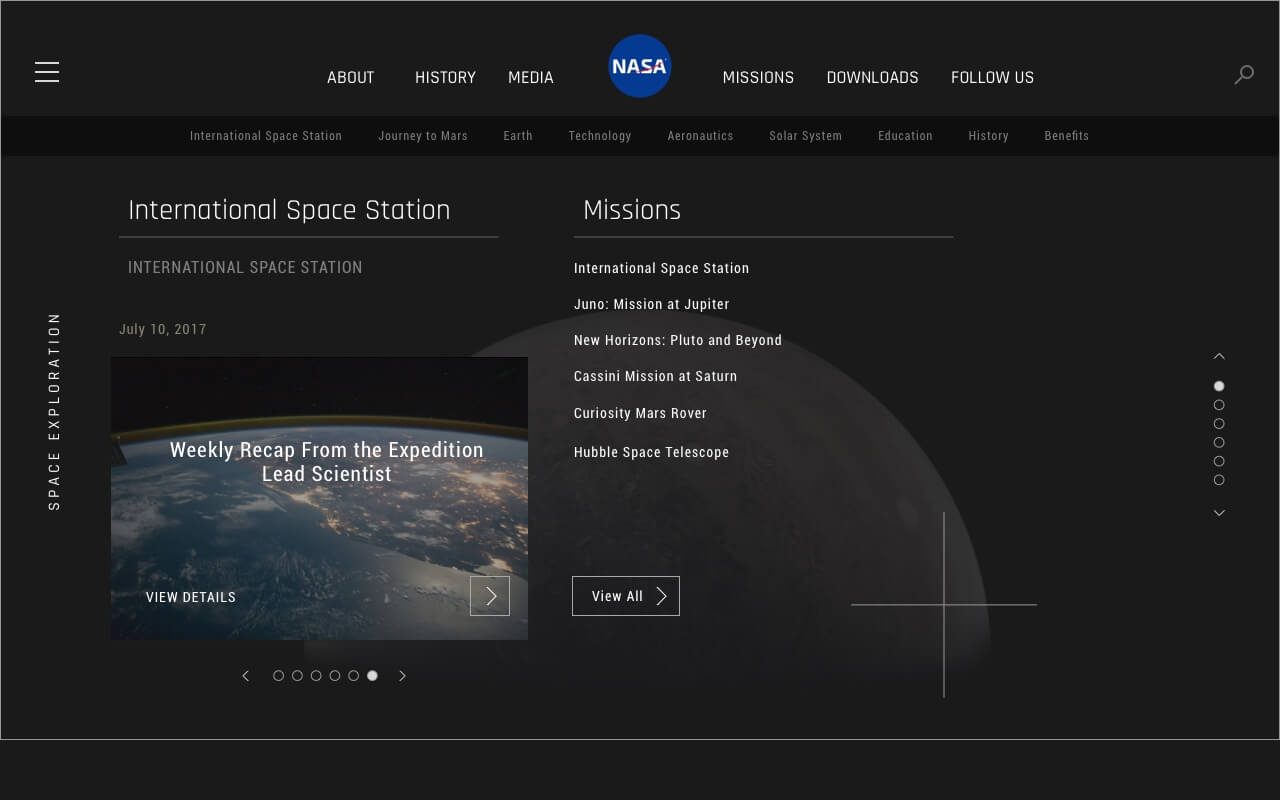
The National Aeronautics and Space Administration has a working website where users can quickly grab information or articles related to space and space exploration. Unfortunately after diving in, I grew frustrated with the abundance of content and lack of distinct navigation.
Existing Site
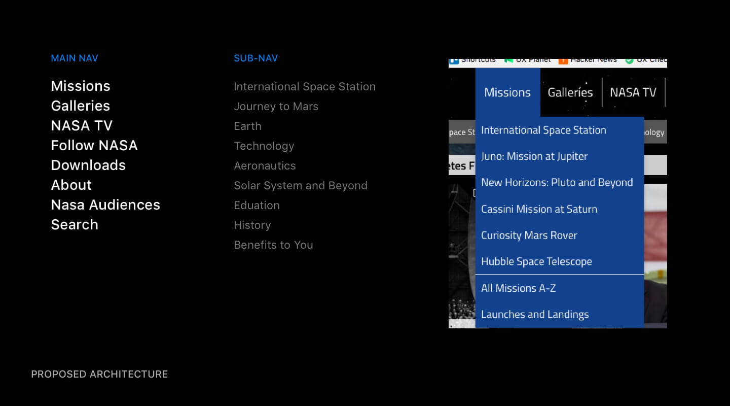
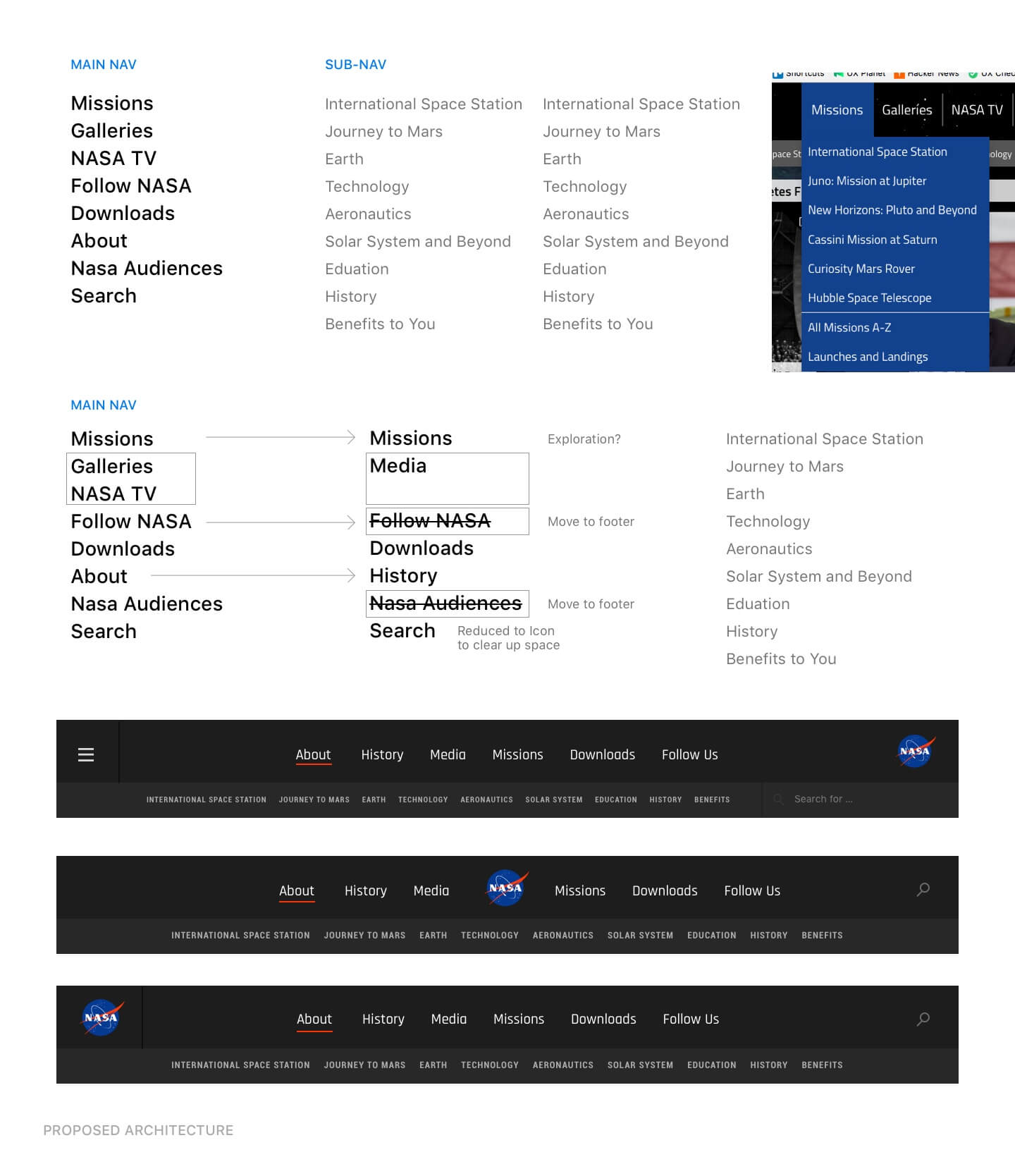
Navigation / Information Architecture
Users may not be able to effectively digest or navigate the abundance of content with the current site layout and architecture. This may leave users to abandon the page, feeling overwhelmed and unsure how to arrive at desired content.
I felt the current architecture needed most improvement, deciding to cut down significantly on available user paths as well as combining select content into defined sections to more easily navigate through the site. Combining navigation links, and moving appropriate information to the footer also placed a higher priority on updated content.
Existing Navigation / Architecture
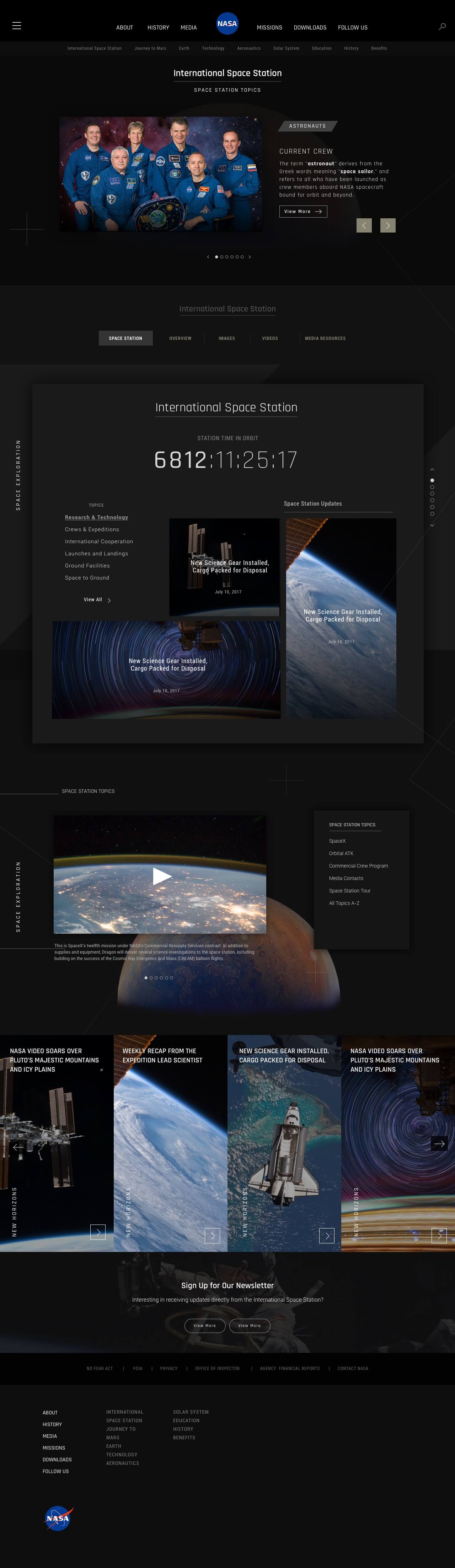
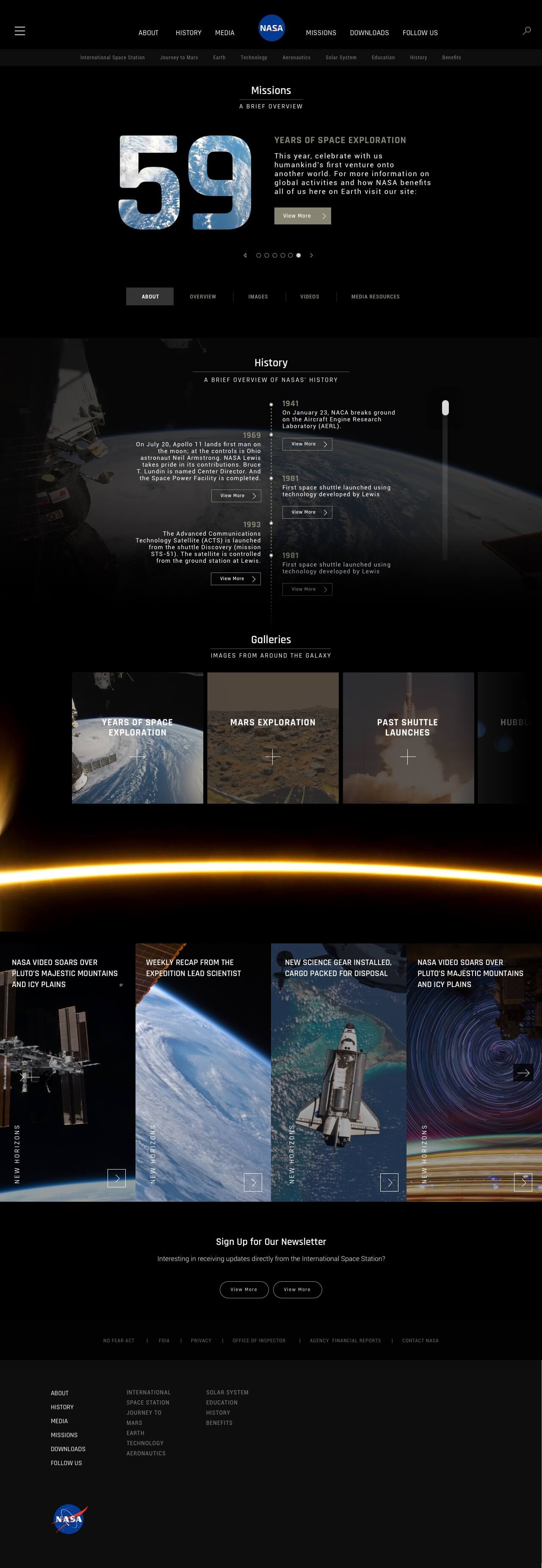
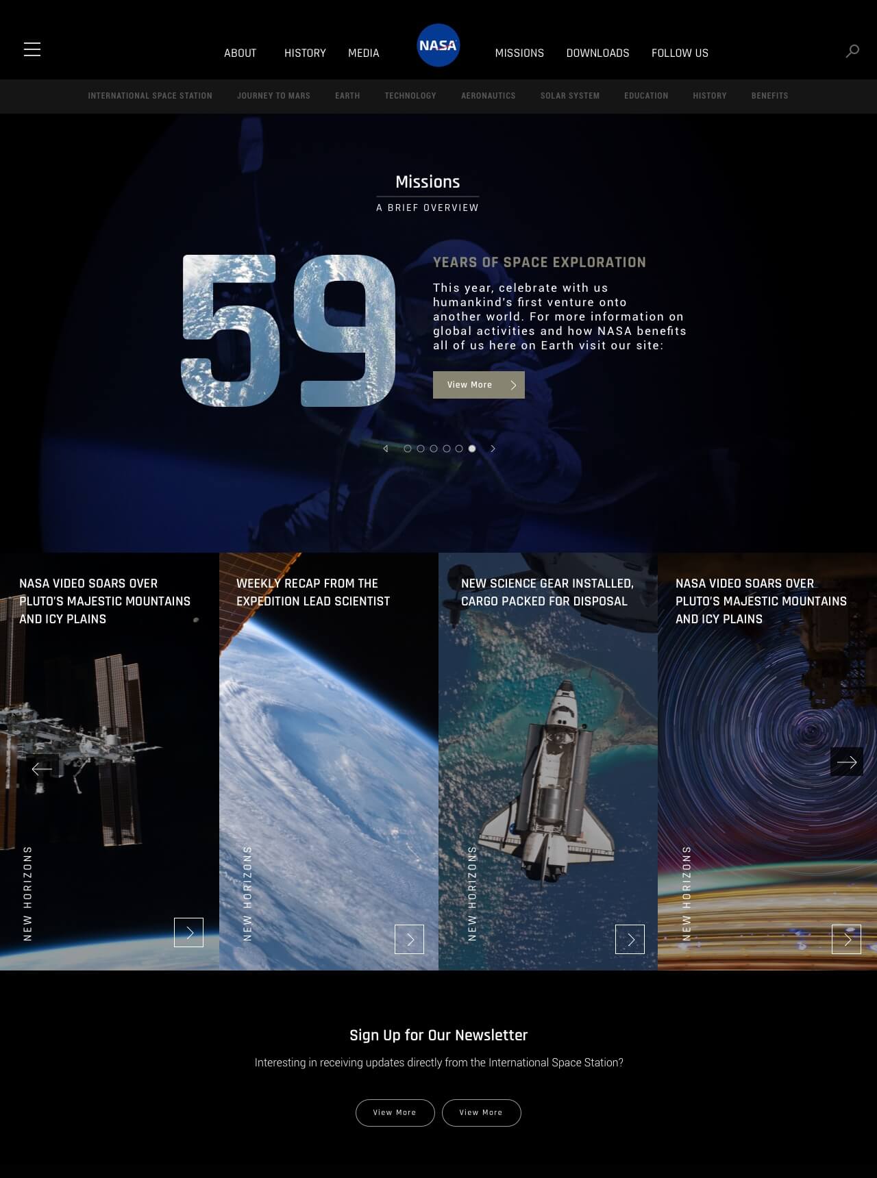
Main Page
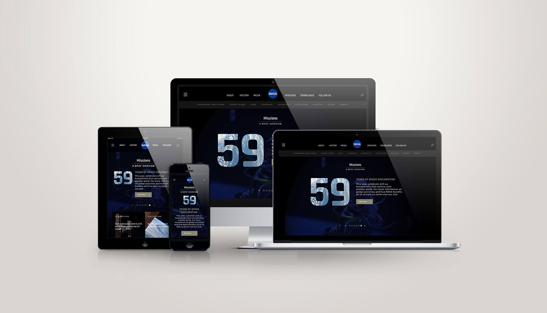
Instead of the abundance of assorted links throughout the homepage, I decided to break apart the content into defined sections, displaying a select few for each of the main categories throughout the homepage. The current layout acted as a board displaying all types of articles. We’re hoping with the new design, users can navigate to a specific article, or overview of articles to determine where to head next. With the newly defined information architecture and homepage content, we are hoping to effectively engage new visitors and returning visitors alike.
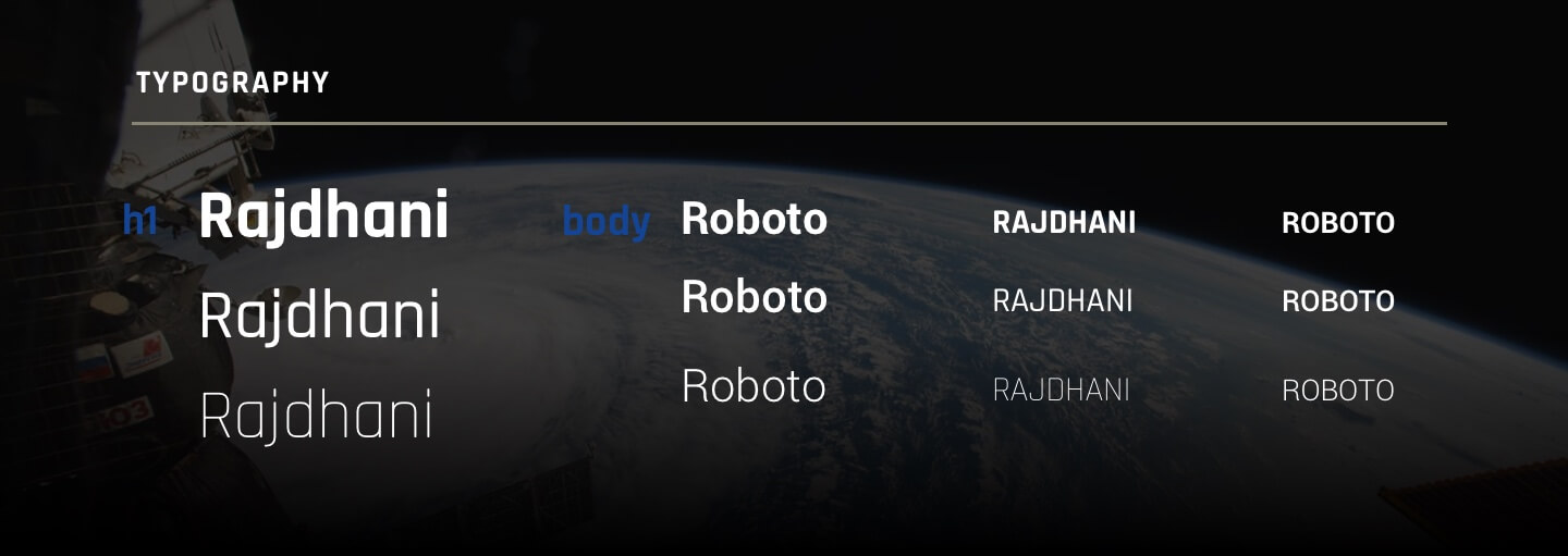
Typography
The Rhajdhani font struck a fair balance between NASA logos of old with a modern spin. It conveys a clean, futuristic aspect while maintaining a conservative balance as to not deviate to far from existing branding. It’s counterpart throughout the homepage redesign, Roboto, also offered by Google fonts. We found this to be the perfect complement for body text and supporting copy.
Visual Design
The new homepage design built off a top to bottom flow, explaining the past, present and future of Nasa and space exploration. The dark background imagery conveys the vastness of space exploration, with supporting elements throughout to support a modern visual layout. We hoped interactivity could play a huge part in regards to displaying an abundance of information with relatively little space.
The existing card style interface made sense to maintain, offering visitors key details without having to click on the article – this can get repetitive and tedious with as much content as there is. Expanding on the existing visuals, I utilized the collection of high-resolution images as a focal point for many of the sections and articles.
Conclusion
There are plenty of articles and updates floating around the web involving recent technology advancements in regards to space exploration. It’s disappointing to see some of our favorite government agencies fall behind with their online representation considering their respective responsibilities and accomplishments.
This is currently an ongoing passion project of mine, hoping to continue building and evolving the presented concepts well into the future.
What's Next
If you'd like to chat about an upcoming project or just want nerd out on the latest design technologies, drop me a at [email protected]. I'm currently AVAILABLE for research and strategy, user experience, user interface design, and product management opportunities. Let's build something incredible.