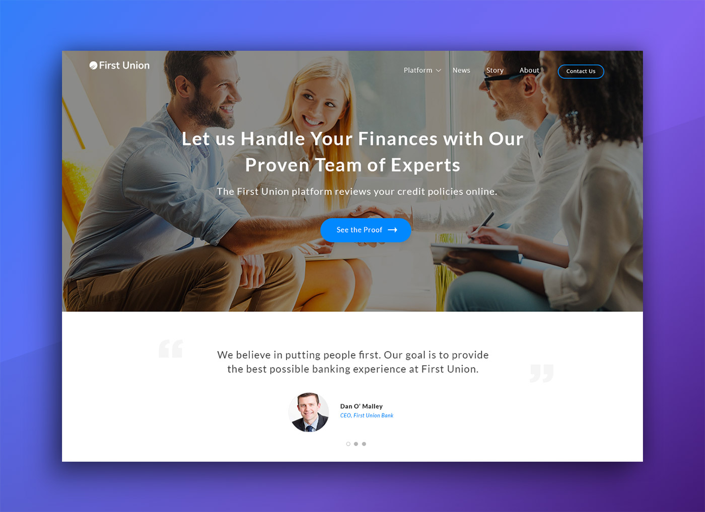
Single page website built for an East Coast online and digital credit union
Role:
Lead Designer
Context:
Team Lightboard
Tools:
Photoshop
HTML/CSS/JS
Intro
We had the opportunity to work on a range of First Union customer-facing marketing collateral including custom HTML emails and landing page to kick-off an upcoming product and brand launch.
Background
First Union was a new player on the block, evolving their existing ecosystem into a new banking platform, evolving the future of online credit. They were nearing product launch and needed a landing page online quickly to help accelerate marketing efforts.
Initial Exploration
The initial concepts were well received, giving us the go ahead to continue flushing out the remaining sections and functionality. We built a variety of layout and modal options in these next iterations, hoping to understand how the site can apply to mobile. Which eventually cut back on some initial design decisions due to the tight timeline.
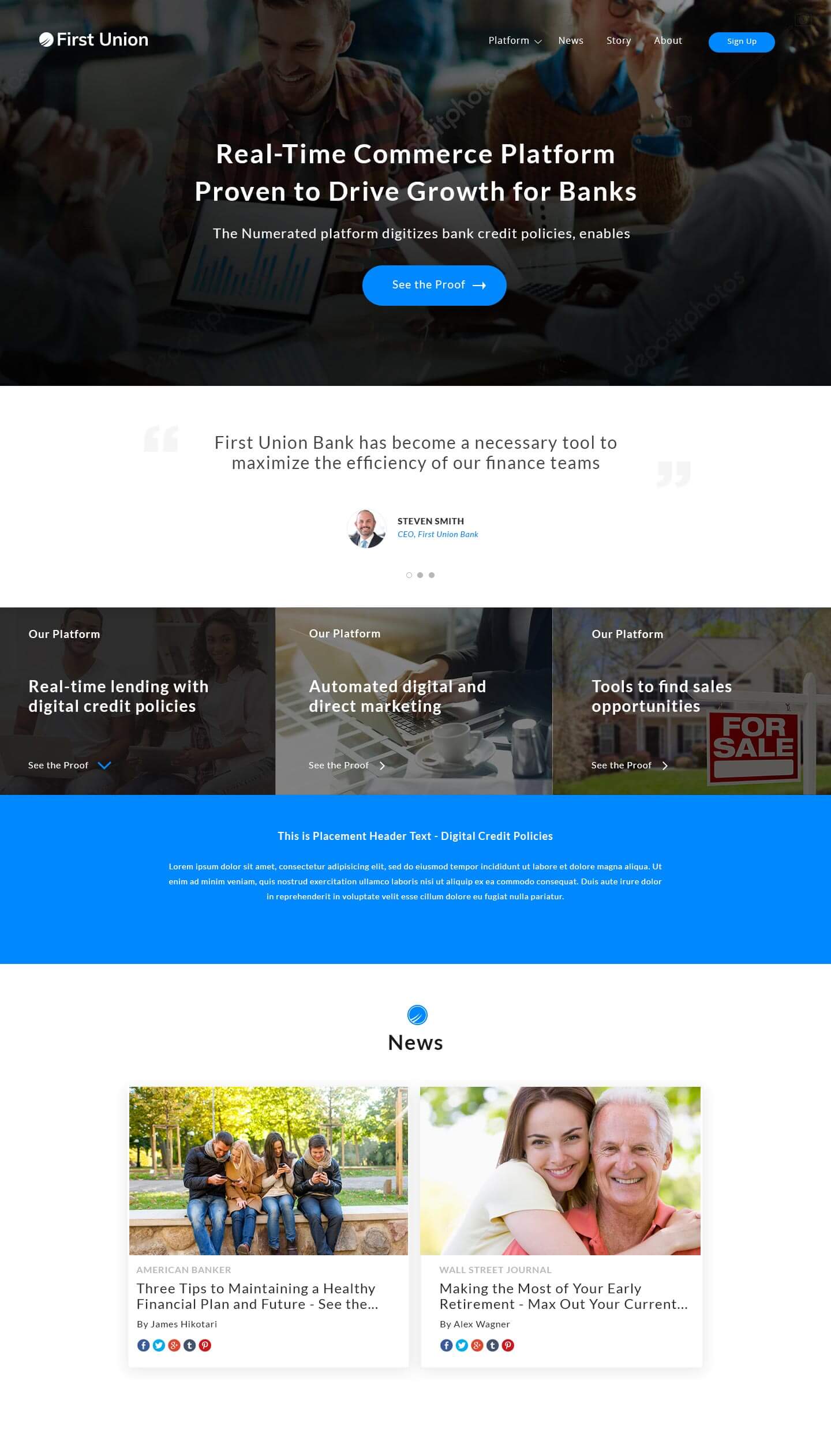
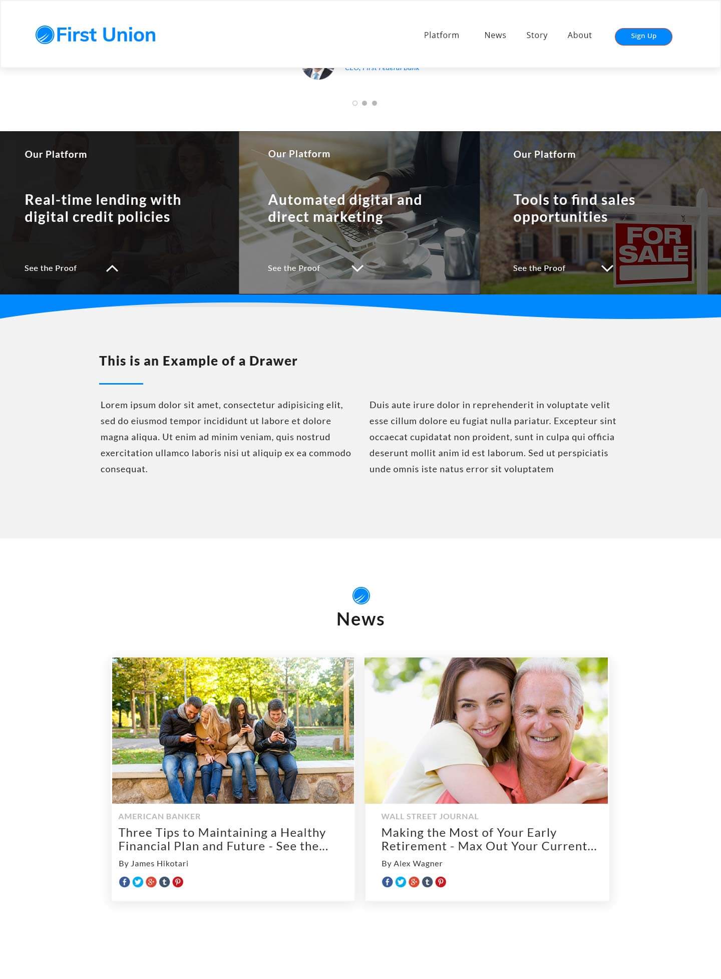
The landing page was designed and developed in-house by the internal team at Lightboard. With product launch approaching quickly, we had to hit the ground running, knocking out an effective, responsive website that communicates First Union’s brand standards and company vision, in just over a week.
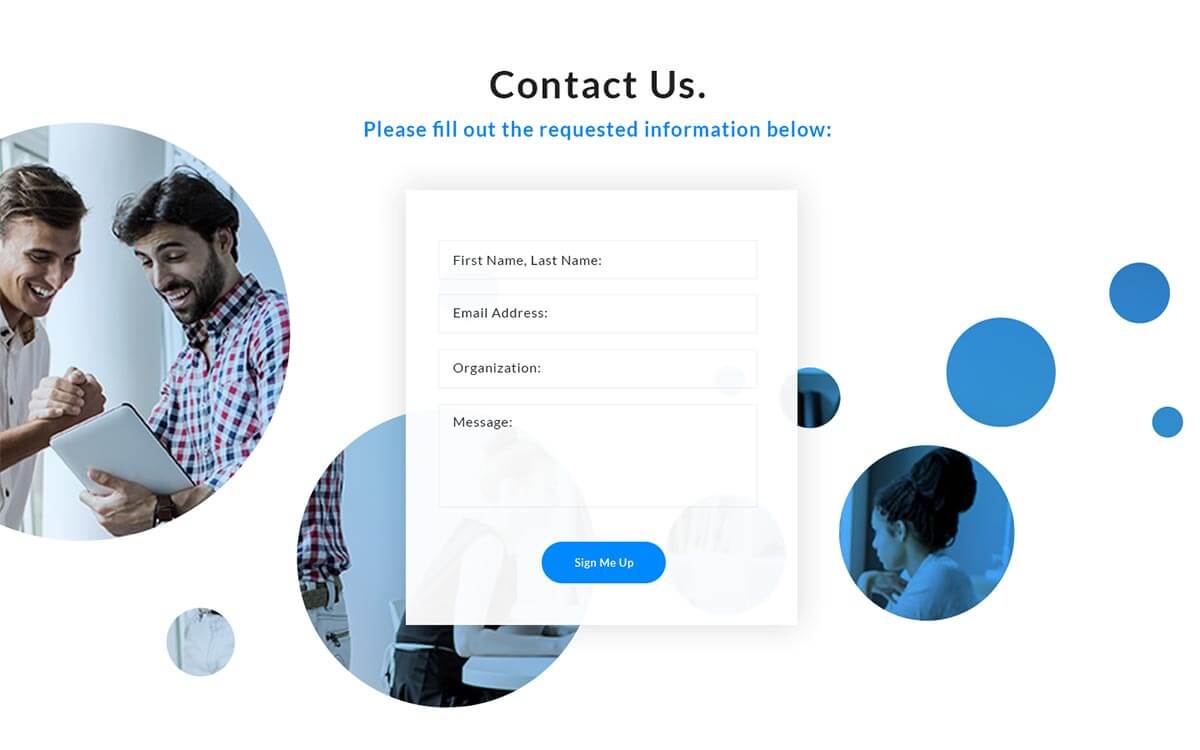
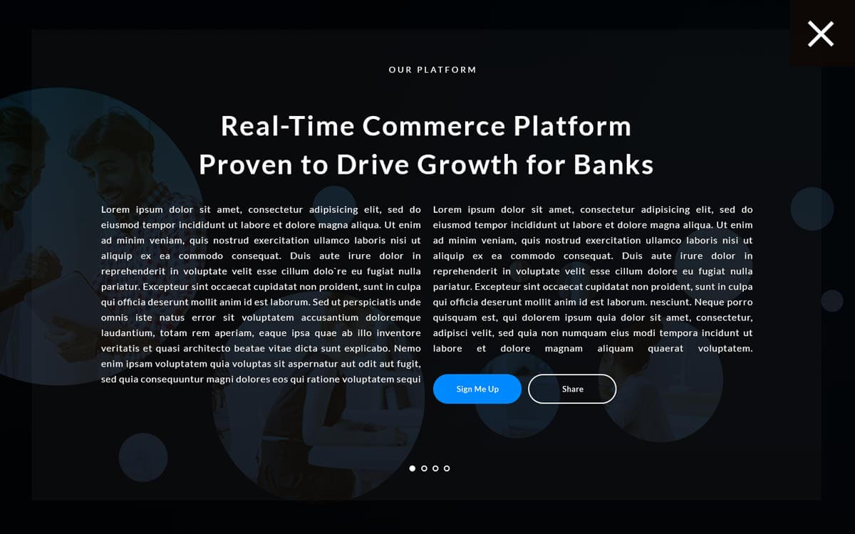
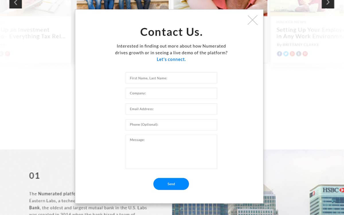
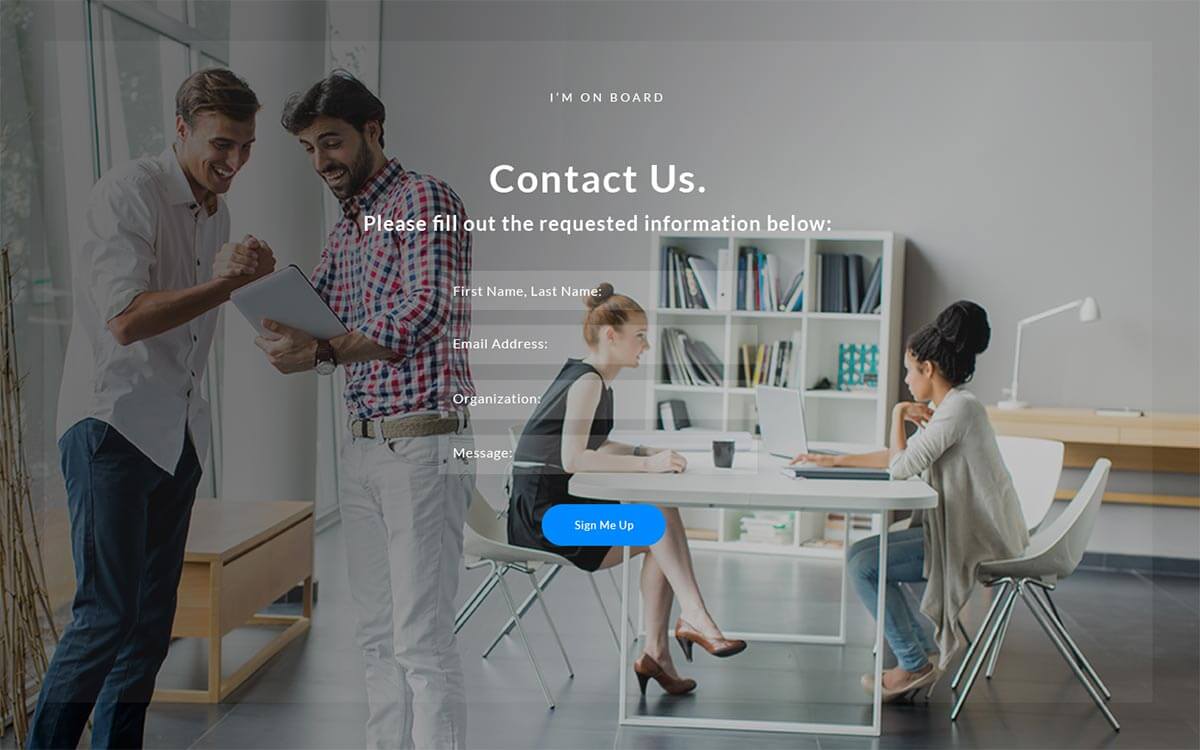
Once that was signed off by our client, we flushed out the full web-page, resubmitting for approval before development. Some design elements were eventually scrapped with the tight timeline, such as the carousel blog articles with transparent overlay, as well as a rotating team member section. The site still maintained much of the interactivity intact despite these changes

What's Next
If you'd like to chat about an upcoming project or just want nerd out on the latest design technologies, drop me a at [email protected]. I'm currently AVAILABLE for research and strategy, user experience, user interface design, and product management opportunities. Let's build something incredible.
Designed and Developed by Corey Mines 👨🏻💻
