CASE STUDIES
Microsoft Bing
Introducing new, and refining core functionality for one of the worlds largest search engine.
Background
Refining and expanding the core functionality of one of the world's largest search engines
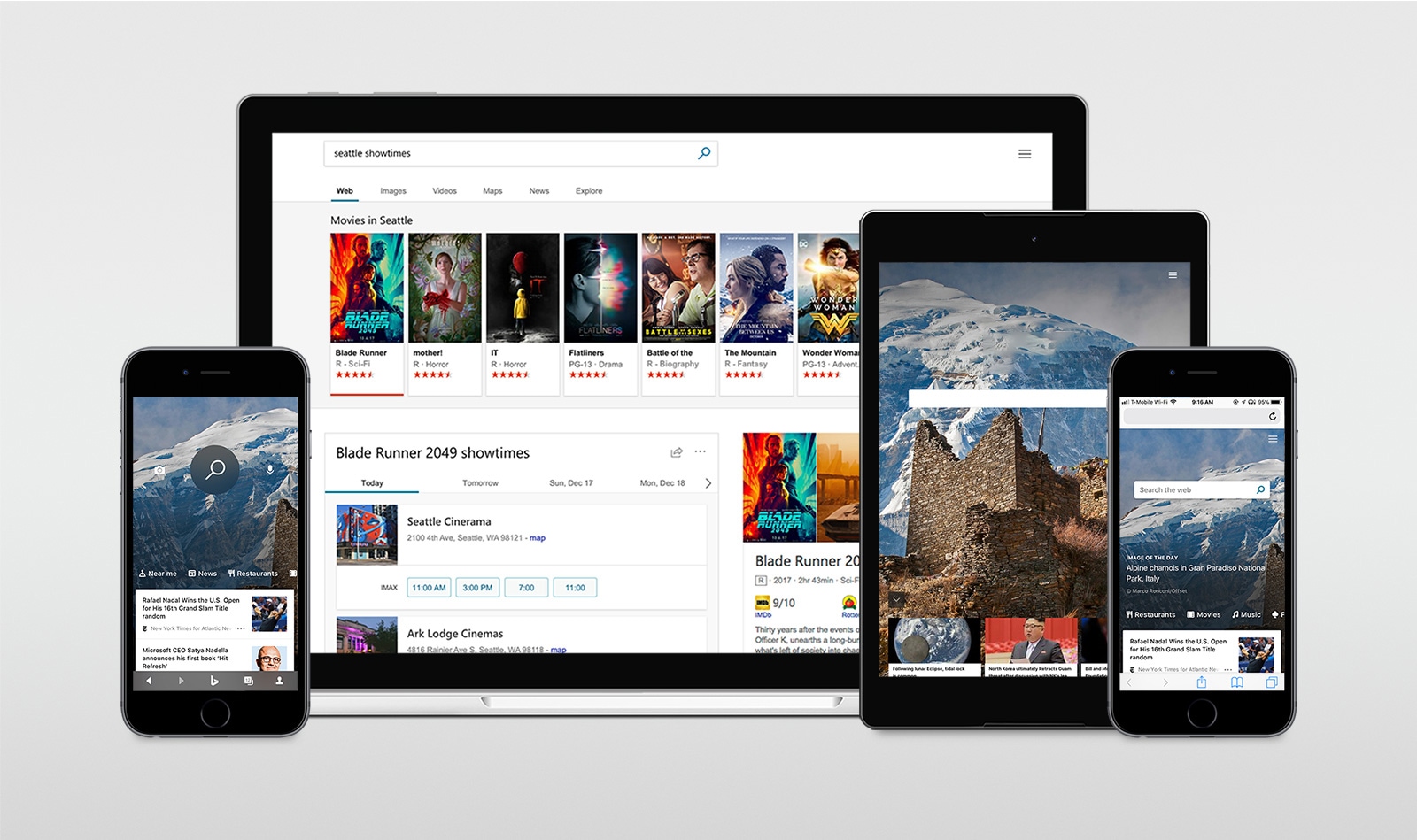
In the modern age of the world-wide-web, finding information online would be near impossible without a handful of search engines that cater content to our every need and desire.
Search engines continue to innovate, adding new functionality to continue automating our daily lives. Whether it’s answering a simple question, setting up reminders, finding up-to-date movie time suggestions or a compiling all the best cat GIFs, only a handful of companies are able to curate content at a global scale.
I had the opportunity to contribute to the internal team focused on expanding upon the world’s largest search engine, serving billions of users on a monthly basis. I worked alongside the engineering team to visualize and translate interface functionality, requirements and refinements across the search engine ecosystem. As we worked to rework the existing design systems, we also worked to refine core functionality, introducing new feature-sets to capture loosening market share, refine the overall user experience and increase customer retention rates across web and mobile environments.
Challenges / Problems
My Mission
- Expanding the communicable guidelines that convey how new features are to be built alongside their visual component systems serving as the primary documentation serving as a common language amongst shared teams all over the world.
- Introducing a new image feed, built within the Search engine image page to expand functionality to create a more immersive and interactive experience for users.
- Refining the on-boarding process for first-time users.
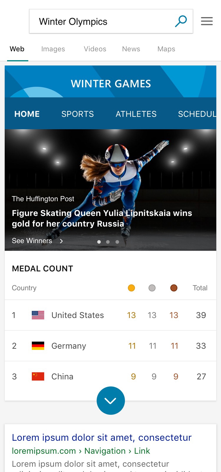
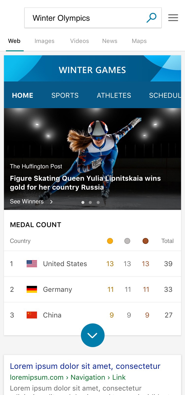
- Overhauling the Winter Olympics leaderboard summaries displayed in-line with search engine search results.
- Creating new identity pieces for Search engine entities that are exploring new data-driven technologies across AR (Augmented Reality) and VR (Virtual Reality).
Contributions
HIG Expansion
The Human Interface Guidelines were an integral part of what we communicated across teams on a daily basis. What was once a scattered source of documentation and face-to-face information retrieval, the team began translating this documentation into a visual representation of the Search engine design system that serves the web-based and mobile applications.
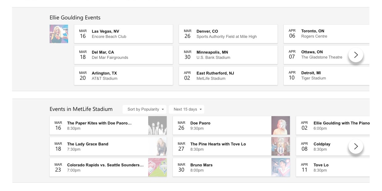

One major developments I spearheaded was a design system / globalized system of reusable shadows and guidelines to replicate them, appearing on nearly every page across a number of elements. It was a huge undertaking, condensing several dozens of styles into a handful of recognizable and communicable styles we were to apply across the web. Despite its relevance as minor detail, as a part of the larger whole, it proved to further enhance and simplify our unified design system.
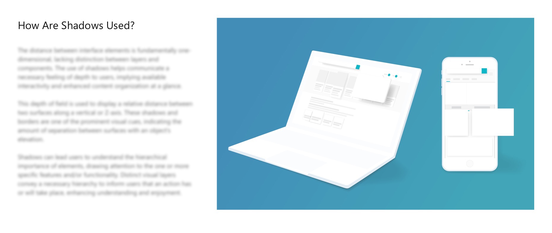
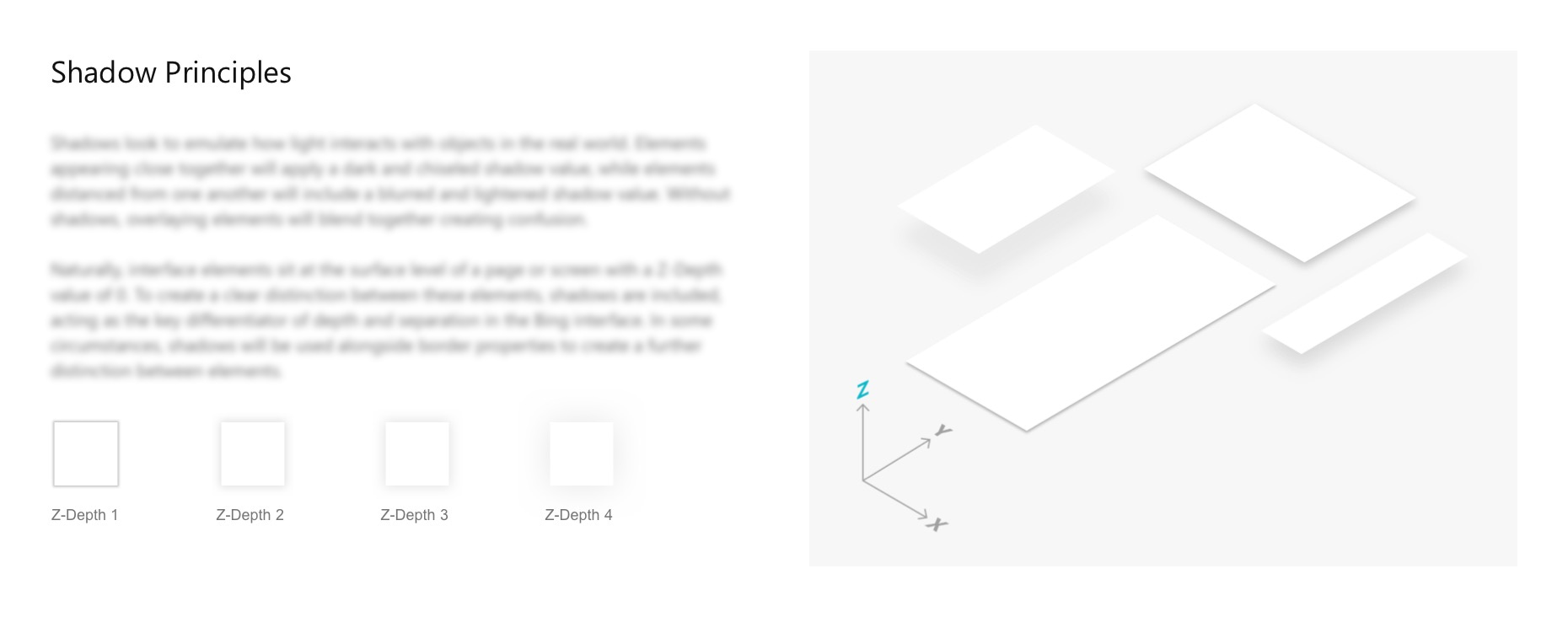
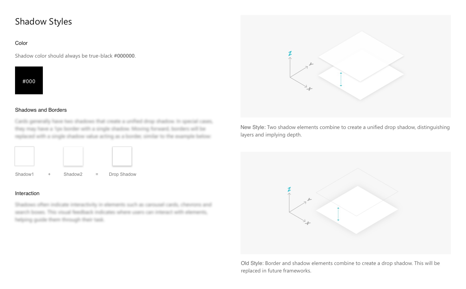
Image Feed
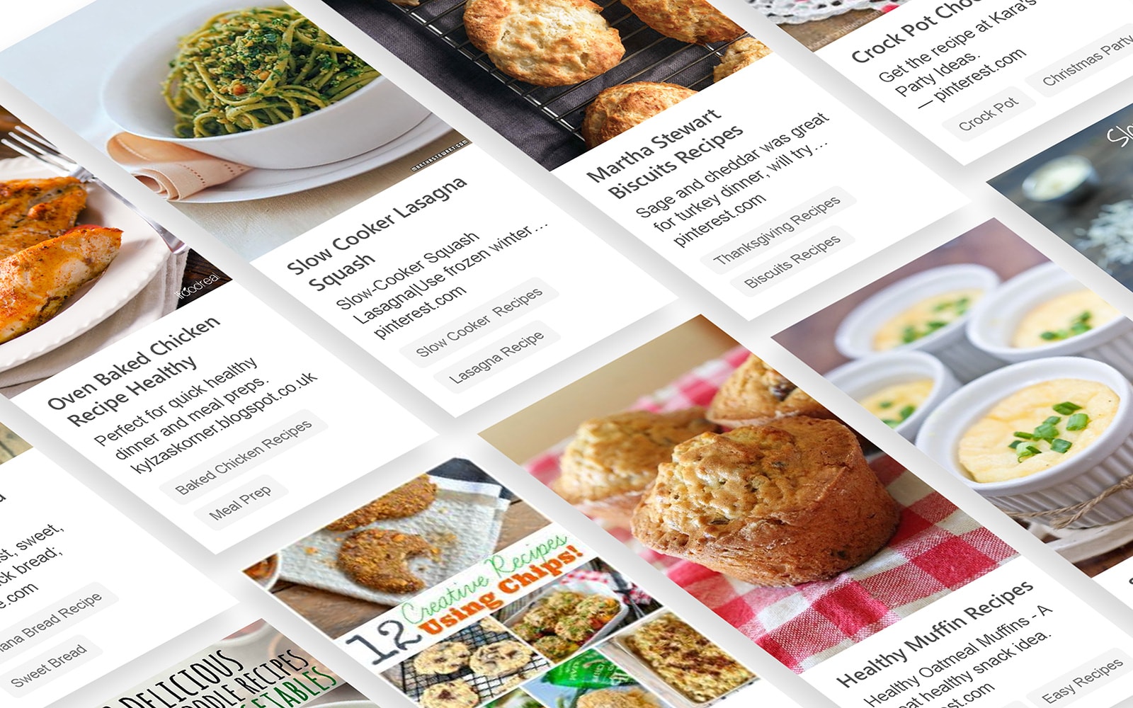
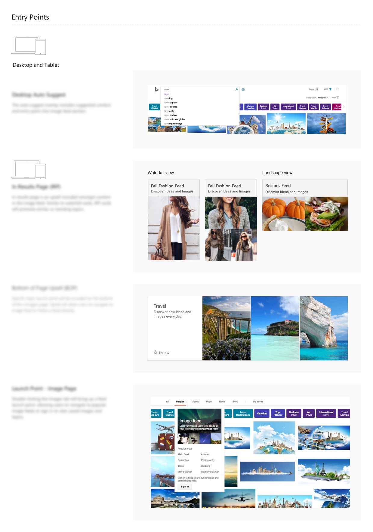
The Search engine Image feed was expansion based upon the existing image page view of the Search Engine. Similar to Google’s image tab, results based on your search query typically return images. Instead of the standard feed of images matching your query, the internal team began researching ways to increase engagement to keep users interacting with the Search engine search engine in a meaningful way.
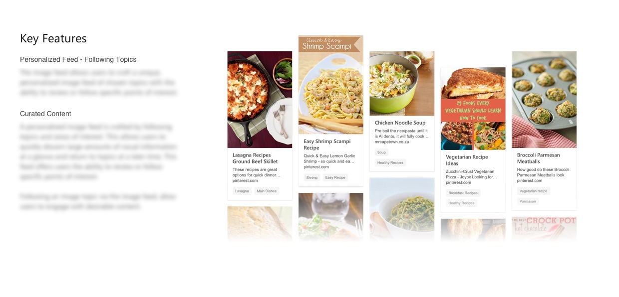
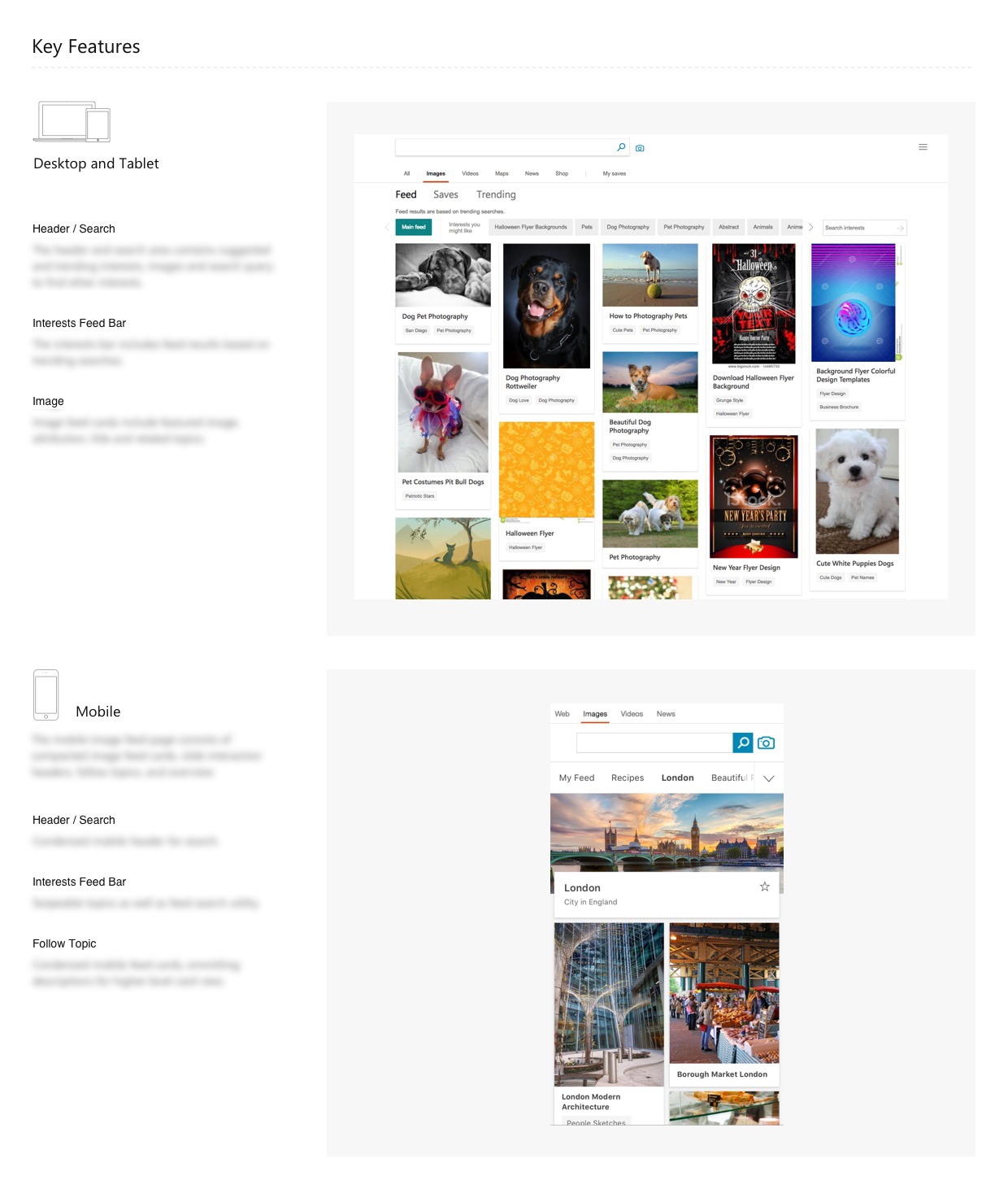
After countless hours of user research, the team began to construct the early stages of what was to become the Search engine Image feed that would eventually include image-based search results as well as trending images and the ability to follow certain topics to get pre-populated feeds based on your current interests. All of these interests and images could be saved to your profile to better understand what you enjoy seeing. Similar to Pinterest, users could curate their own feed as they pleased.
Upon following a set topic, the new image feed would return your main feed of images to match your topic, the source and relevant information. The feed also suggests interests you might like.
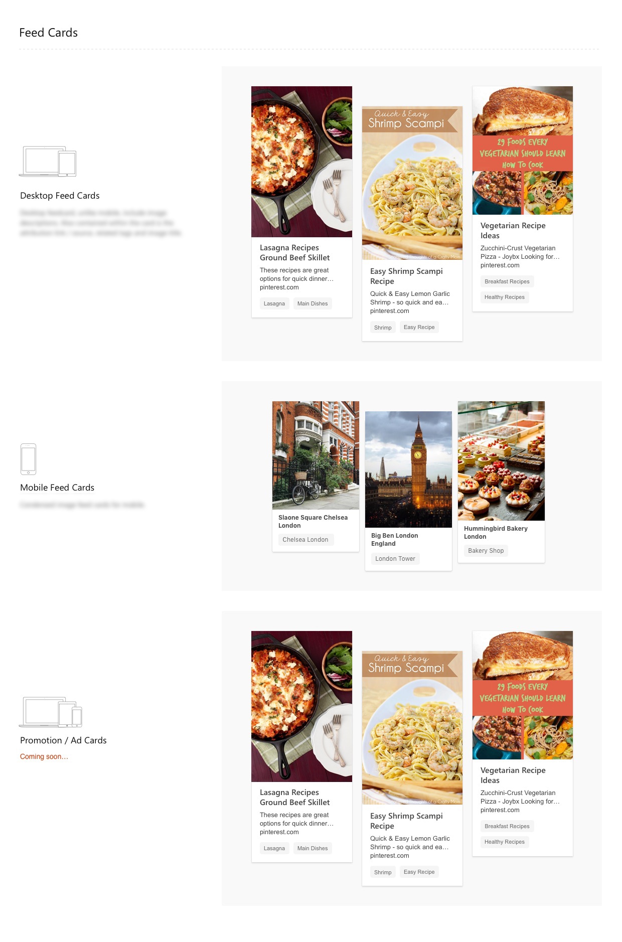
The team eventually incorporated a monetization strategy around ad-based content and affiliate click based marketing. While the team was accomplishing the majority of the heavy lifting on this project, I was able to step in and offer my suggestions as far as a refining the overall user-experience and redeveloping the card-based UI from a macro and micro level.
Onboarding
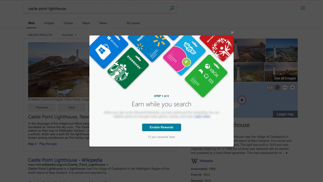
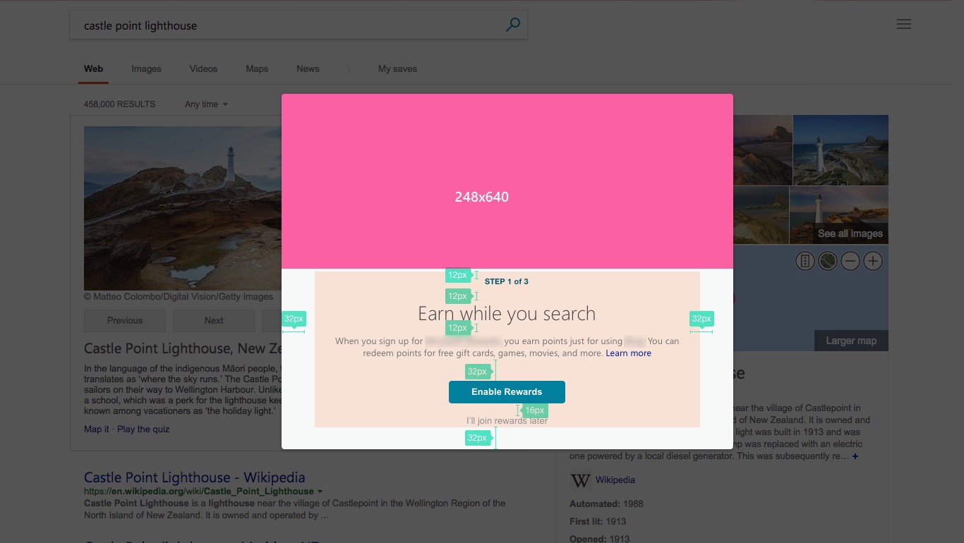
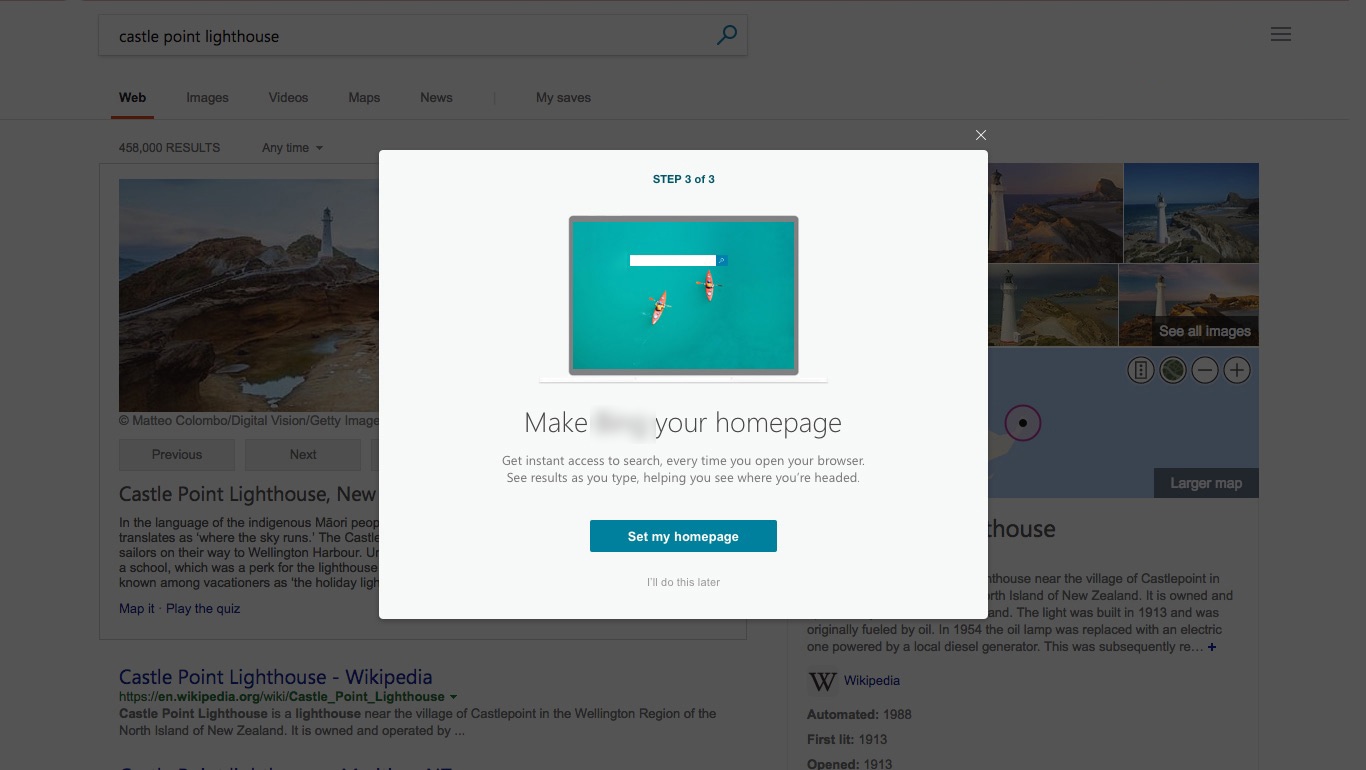
For new users to the Search engine search ecosystem, we worked to refine a revised onboarding process to explain to users the benefits of using Search engine, how to accumulate Search engine Rewards based on usage and how to activate that to their account. Over time, we found these refinements to increase retention rates and reward system sign ups significantly in a period of 6-months.
Olympic Leaderboards
With the upcoming winter olympics during my employment, we worked to re-design and update the search engine results inline imagery surrounding the winter game results and medal counts.
Logo Identity - Research Labs
Our company was constantly pushing the boundaries of the capabilities bridging the design and development space. As technologies began to emerge, so did our capabilities to use these technologies to improve our every day lives.

Alongside the team, we conceptualized and finalized a logo identity for research and development labs focused in the AR / VR space. Although in an early stage, the potential for AR / VR research is significant and we began investing heavily in that idea.
Conclusion
It was a great opportunity to learn from one of the world’s largest global teams building out software and hardware technologies across a variety of industries for decades. I am thankful to having worked alongside brilliant people and had a hand in building some truly incredible products.
What's Next
If you'd like to chat about an upcoming project or just want nerd out on the latest design technologies, drop me a at [email protected]. I'm currently AVAILABLE for research and strategy, user experience, user interface design, and product management opportunities. Let's build something incredible.
Designed and Developed by Corey Mines 👨🏻💻
