CASE STUDIES
Cloud Academy
Providing marketing support for a rapidly growing cloud education platform.

Background
Enterprise cloud training with learning resources across the cloud
Cloud Academy is a leader in enterprise cloud training, delivering a variety of learning resources to development teams that operate on the cloud. Companies trust Cloud Academy to provide quintessential, regularly updated training on the leading cloud platforms including AWS, Microsoft Azure and Google Cloud Platform. No matter the organizational proficiency level, Cloud Academy has the training content to meet every team and position.
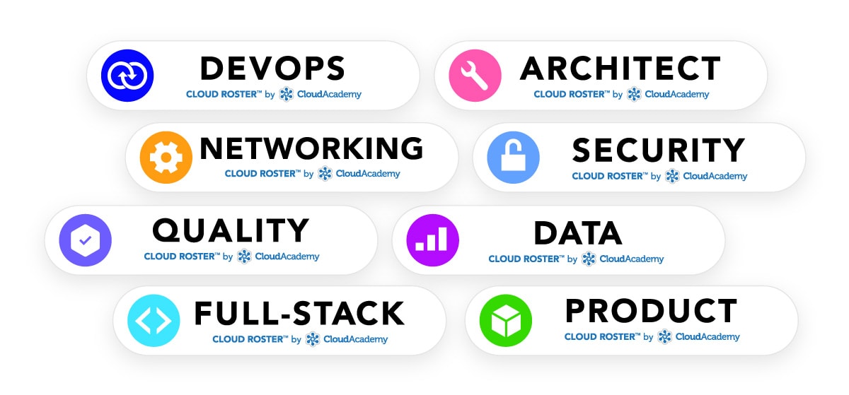
Whether it’s DevOps, Privacy, Security, Software Architecture or Full-Stack Development, the resources and educational content provided unlocks the capabilities of the cloud, empowering organizations with the necessary resources and experience to operate or dive into the cloud.
The business insights this opportunity provided was invaluable, influencing how design decisions can influence business and marketing decisions, how to provide extensible value on a budget, but more importantly, how to deliver value and constantly sell myself and my capabilities.

Challenge / Problem
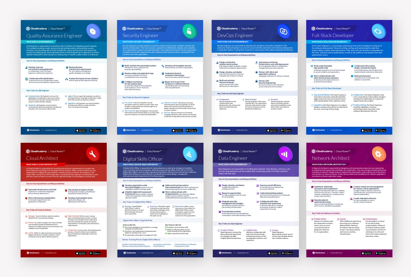
I’ve had the opportunity to work with CloudAcademy on a variety of projects, assisting the marketing team elevate a well-crafted brand into something that more accurately conveys the amount of quality and sophistication as the content the platform is built upon. Over the last year, I’ve been focused on re-branding their marketing communications material, ranging from emails, website designs, sales collateral, leave-behind material and illustrations. It’s been an incredible journey seeing the evolution of the brand as they begin to take over the cloud education market.
Research
Market Fit
The team was hard at work filling in gaps with their marketing existing material. Much of this collateral varied in styles, with executional inconsistencies presented by a lack of a significant design presence. The goal was to elevate the brand material giving a more sophisticated first impression to meet their target demographic and primary user-base.

There were a number of companies we identified that successfully tailor their brand to a similar audience demographic. We spent time identifying what the similarities were to how best to communicate to our target market, adapting current marketing design systems to apply a new look and feel gradually over time. Starting small, we began to apply several approaches we found could be appealing to our target audience in the tech-space. These changes occurred in a number of email communications and sales pieces.
Execution
CLOUD ROLES / SKILLS PAGES
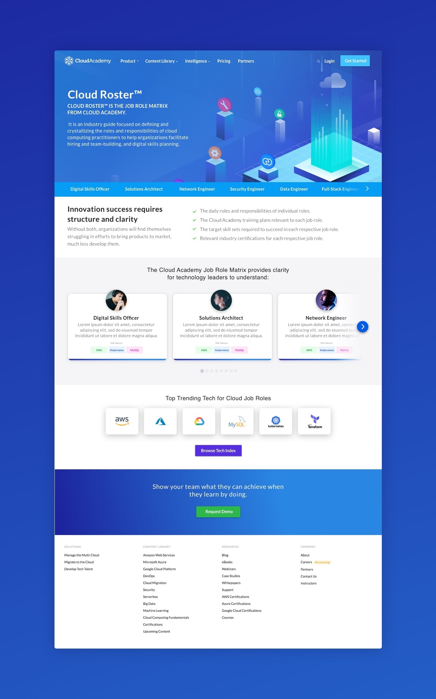
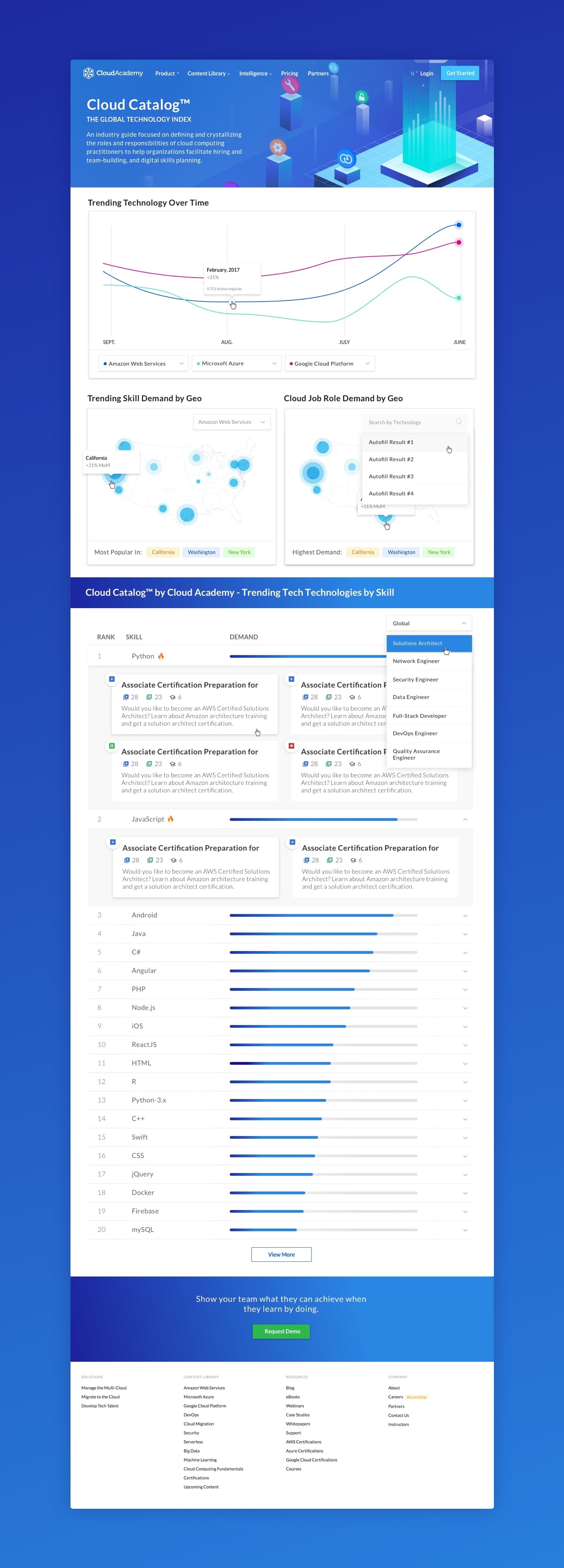
Some major pieces we spent considerable time on as a team was the new “Cloud Job Roles Matrix” and “Cloud Roster” web pages that are proved to be an invaluable resource for prospective organizations to understand the current state of cloud computing by job role and / or technology. To some, adopting cloud based technologies in their organization sounds like an insurmountable task. Without the proper education and guidance, it is a technological hurdle not worth the risk. The goal of the pages that is to clearly illustrate the necessary developer roles required to form a successful cloud development team.


The Cloud Job Roles Matrix presents the top trending cloud technologies over time by demand, geolocation as well as a stack ranking of trending and evolving skills by demand. Cloud Academy collects and analyzes over 3,000 US-based job postings daily to help you understand unmet technical skill demand. The reports provided are updated regularly to explore changes by job role.
These cloud skill and job role pages have gained significant traction in the community by both developers and large organizations. They are a pioneering resource in the field, offering unique and invaluable insights for organizations looking to take the first leap into the world of cloud computing.
PRICING PAGE
Another area for significant improvement was the pricing page. The feedback from a number of users and team-members was that the current pricing page was not accomplishing it’s main purpose - giving users a sense of what we offer and how much it costs, giving a users a sense of the value provide and making them confident in their choice to bring themselves or their team onboard to CloudAcademy.
We decided to take a fresh and unique take on the pricing page, including not just a table of pricing as CloudAcademy is focused largely on Enterprise sales, but a dynamic page that scales based on the number of seats needed. We felt that this new take was a huge improvement, instilling confidence in prospective users, providing useful ammunition to present to individuals in charge of purchasing decisions.

Conclusion
TAKEAWAYS
We continue to expand upon the visual style of Cloud Academy, across a variety of channels and assets regularly. There’s never a shortage of things to re-design or create for this rapidly growing market leader in cloud education resources. It’s been incredible to see the journey of emails, solution sheets, case studies, website updates, visual identity and illustrations.
Over time, the style began to evolve into its current form. We received great feedback from the team on the revised direction and worked together to continue applying the new styles across a variety of content with multiple contributors.


What's Next
If you'd like to chat about an upcoming project or just want nerd out on the latest design technologies, drop me a at [email protected]. I'm currently AVAILABLE for research and strategy, user experience, user interface design, and product management opportunities. Let's build something incredible.
Designed and Developed by Corey Mines 👨🏻💻
