Lightboard Case Study
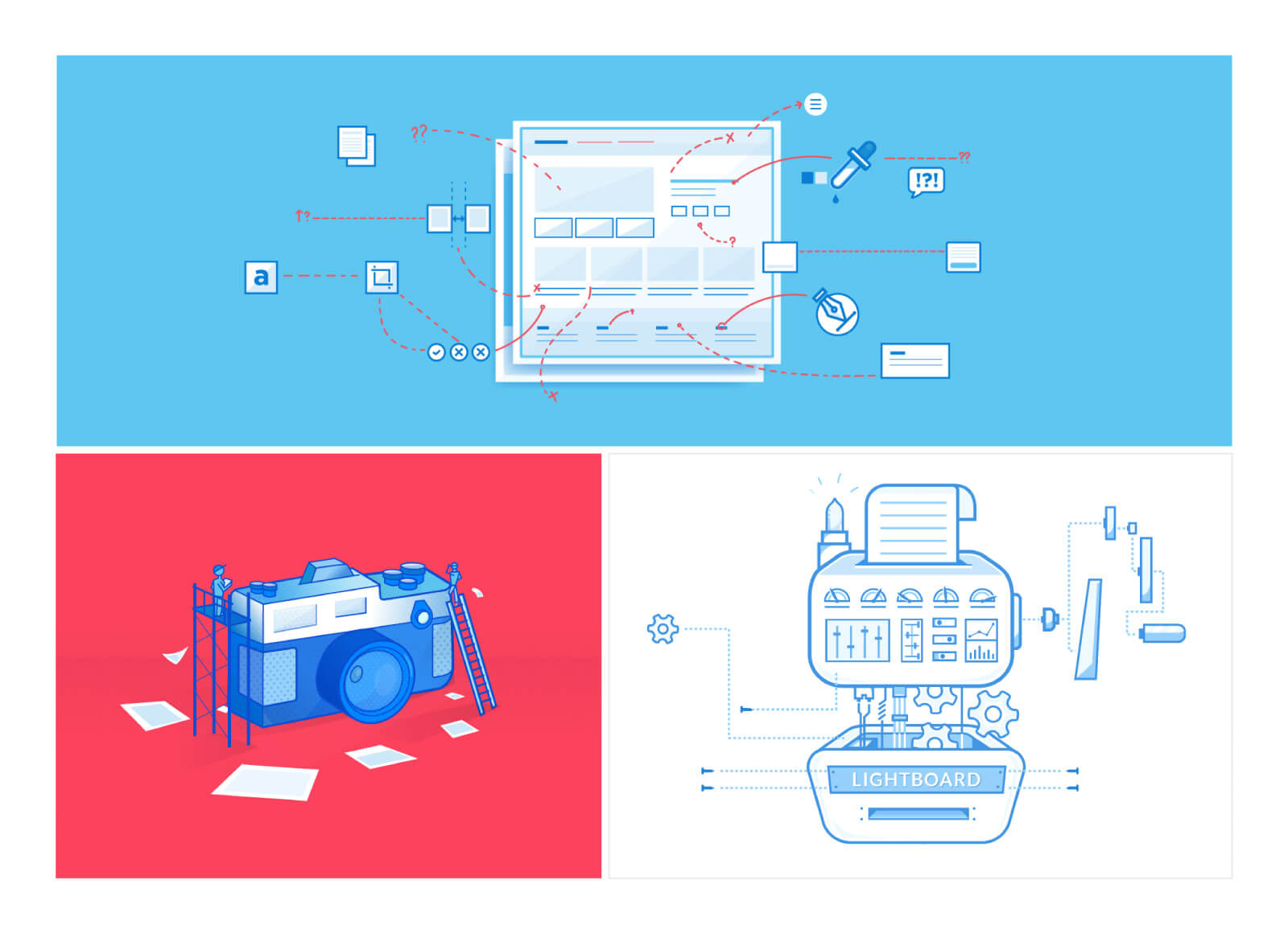
Samples of internal illustrations over the course of my employment at Lightboard this last year
Role
Lead Designer
Context
In-House
Lightboard
Team
Tools
Sketch
Principle
HTML/CSS
Intro
For the past year, I had the pleasure of working for Lightboard as the in-house lead designer. It was an incredible experience working in both the marketing and software side of a new agency model, providing marketing collateral for a wide variety of companies, large and small.
Though most of my tasks involved client work, I did manage to do some internal illustrations as the product as the company grew. It was great seeing the brand evolve over time to match the goals and future.
Illustrations
Lightboard was still a relatively new company when I started. There wasn’t a set style or look going in. At the earlier stages of my employment, we were able to hone in on something that we felt that was able to effectively represent the brand aesthetic and integrity.
Early Stage Icons
Early in the process, we looked to define a cohesive visual style. Of these initial illustrations, we used a monochromatic, monoline style utilizing the Lightboard primary blue. This was initially built to flush closely to the existing site and the limited color palette at the time. The style ultimately didn’t stick but offered a solid foundation to build future concepts and iterations upon.
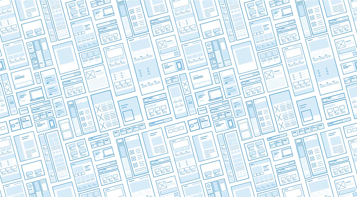
Later Iterations
Later versions of the icons used a similar monoline aesthetic, mixed with a typical flat, web illustration style. The linework supported the overall shapes, effectively working as both standalone, small icons, and at larger sizes for internal, web and communicative use.
As a part of Lightboard’s internal software offering, we eventually carried over our illustrations into icons to represent each phase of customer design projects. These would be seen online with our marketing landing page, as well as the internal platform when requesting a project.
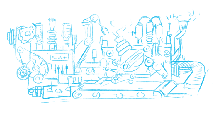
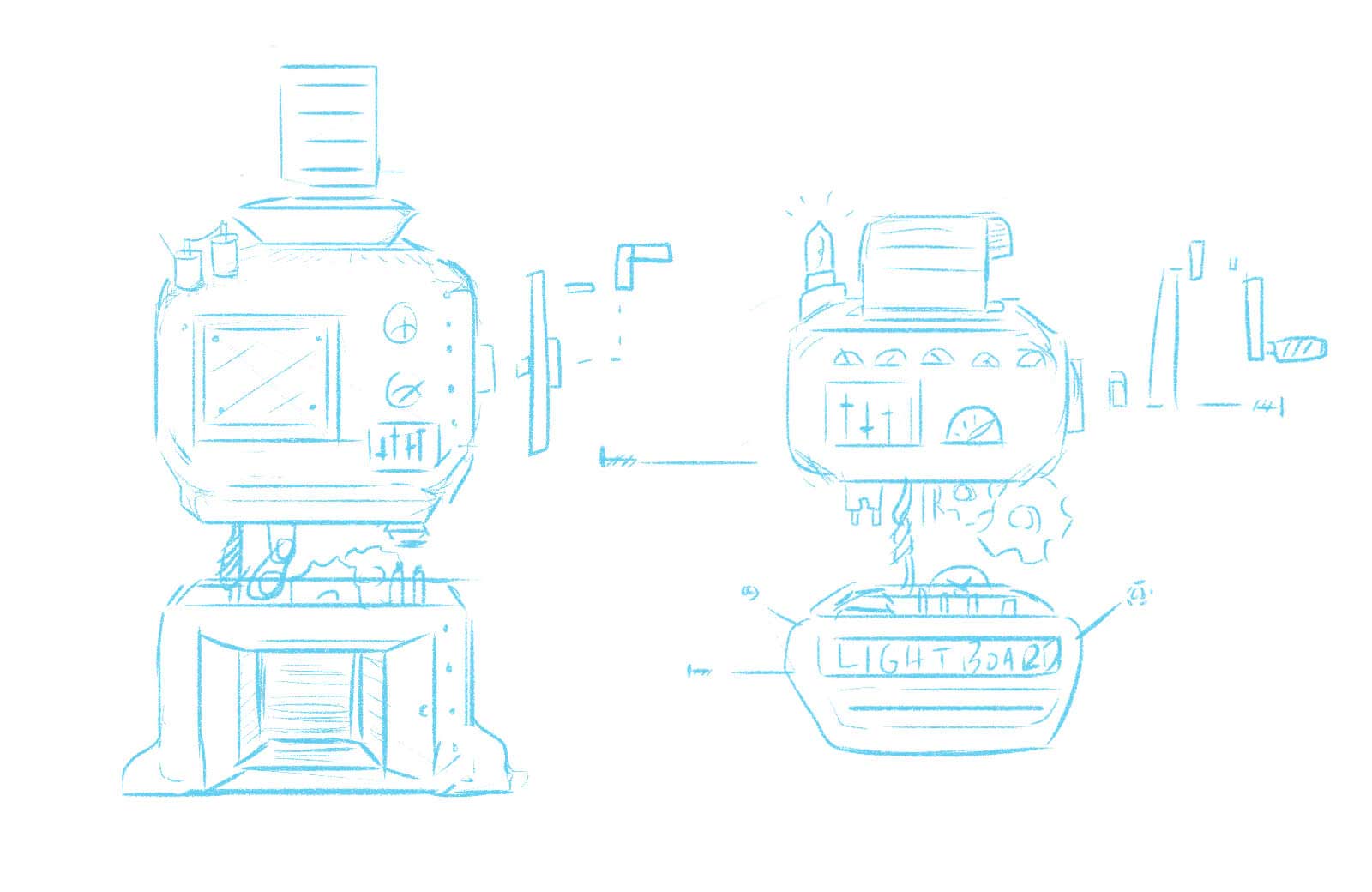
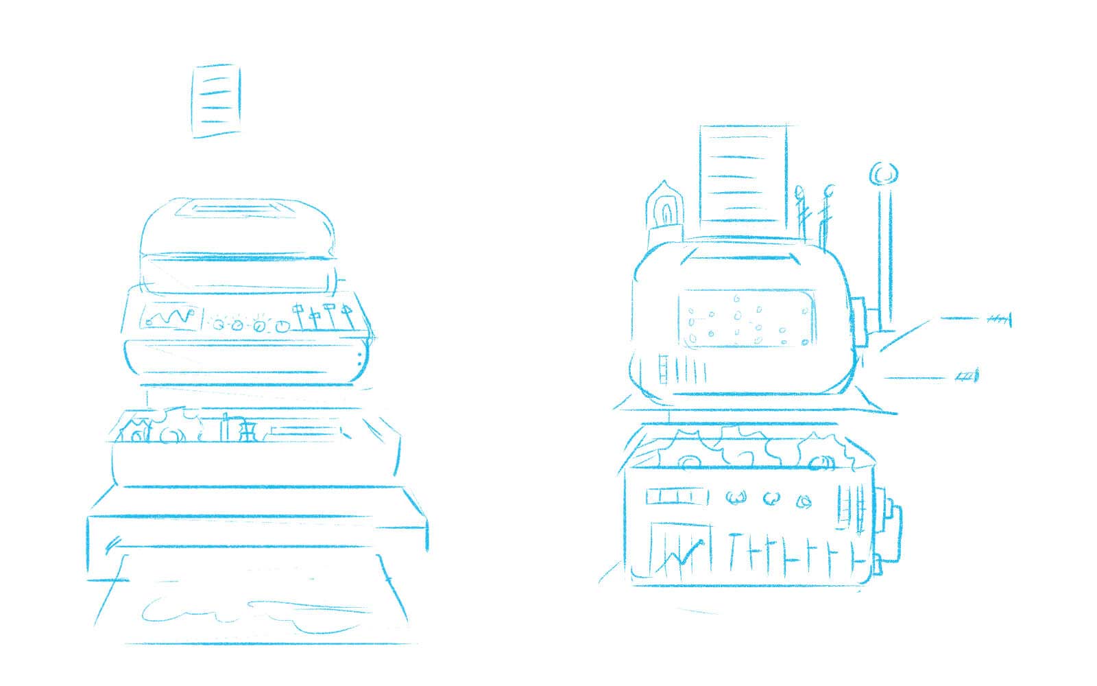
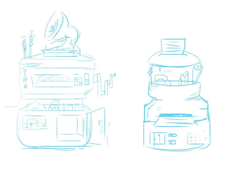
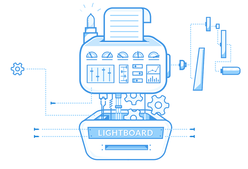
Robot Process Illustration
The Lightboard robot was created to convey the design process, from ideation to creation of marketing collateral. The system symbolizes the systematic ease of use the Lightboard platform provides, effectively differentiate the product from competitors in the marketplace.
Blog Illustrations
As a part of our content marketing campaign, we began to push internal blog posts offering useful advice and tips to marketers and would-be designers alike. With this, we decided this could be a great place to utilize the illustrations as both a client facing marketing tool, and secret sauce to a good blog post. The newly defined style was carried over into existing blog illustrations, and internal icons.


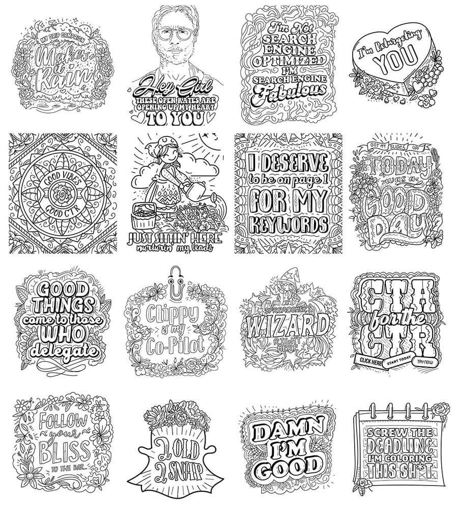
Giving Back: Coloring Pages
One of our existing, ongoing projects involves giving back to our favorite people. We work with many of our best customer on a daily basis so we thought this could be a great opportunity to do something fun, giving back to those who help keep us going steady.
The following are from a set of coloring pages incorporated into one of our free giveaways. With it's ongoing status, I hope to post future updates on this project once it's fully launched.
Conclusion
It was a pleasure working on the internal Lightboard illustrations and watching the product, and illustration style evolve over time. We hoped to create something we could build upon in the future as the brand direction continues to grow and evolve.
What's Next
If you'd like to chat about an upcoming project or just want nerd out on the latest design technologies, drop me a at [email protected]. I'm currently AVAILABLE for research and strategy, user experience, user interface design, and product management opportunities. Let's build something incredible.