CASE STUDIES
DOGDASH CASE STUDY
A personal project, aimed to provide the means to connect aspiring pet owners and pet adoption shelters.
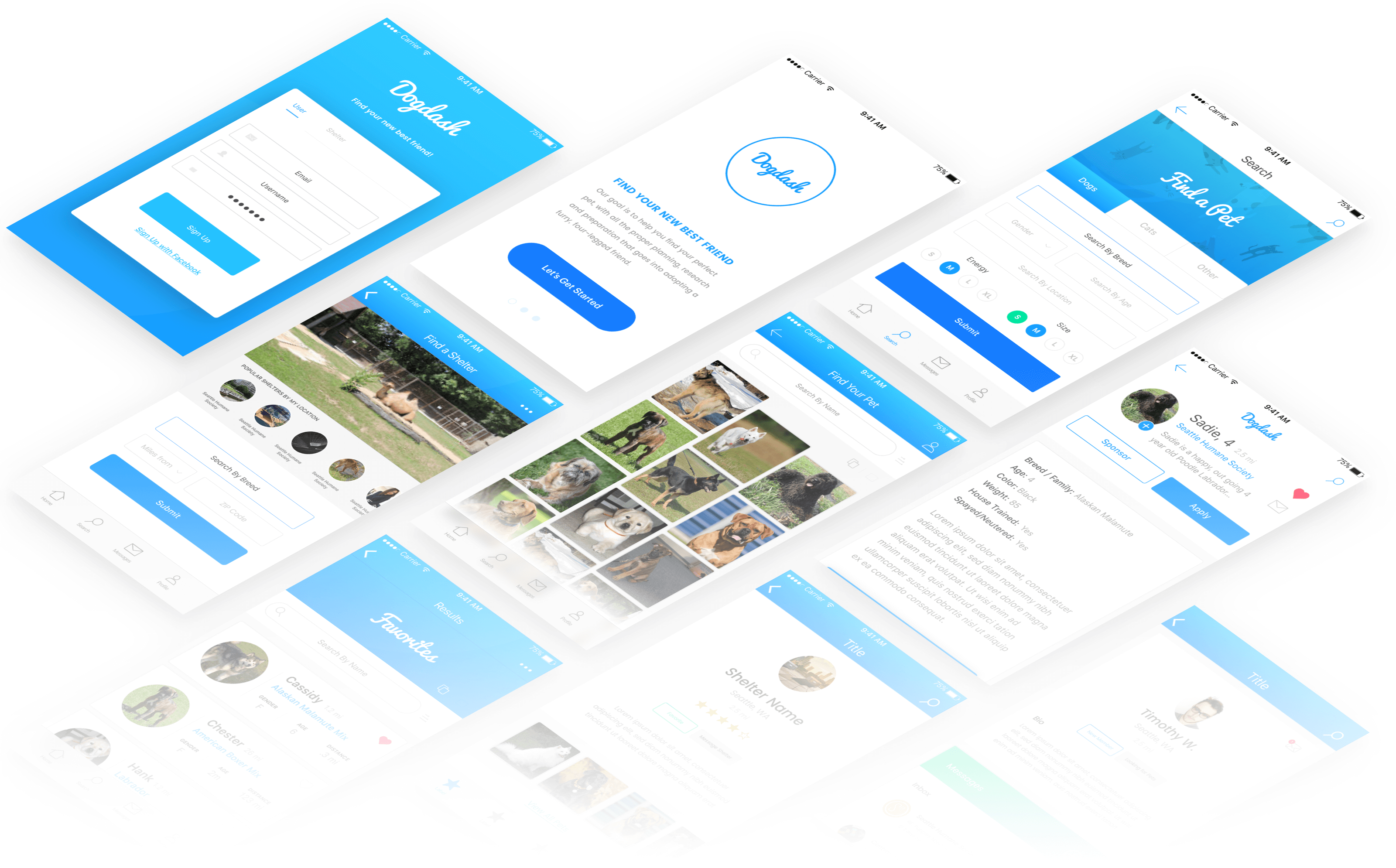
Intro
Dog Dash is a personal project, aimed to provide the means to connect aspiring pet owners and pet adoption shelters.
My goal in the ideation and execution of Dog Dash was to provide the means for young and old pet owners to adopt a furry friend perfectly suited for his or her lifestyle.
Background
In my personal experience trying to adopt in the recent months, I grew frustrating with the current offerings that connect pets and to-be pet owners. Most existing competitors lack coherent user interfaces, search capabilities, and filtering. Ultimately these downfalls, as well as a lack of mobile readiness, ultimately create a whole new set of pain points.
In creating this app, I hope to introduce pet adoption as a reasonable means of pet acquisition. Dog Dash aims to create an accessible, understandable and trouble free process, eliminating much of the identified pain points experienced during a traditional pet adoption process. With more and more advancements and accessibility of technology, these services can provide a necessary change for good, continuing to connect qualified pet adopters and adoptees (woof).
Current Painpoints:
- Not user friendly
- Not viewable on mobile
- Search feels clunky – hard to sort multiple results instantaneously on mobile devices
- Unstable – Crashes too frequently to be used
Dog Dash was built to solve a few common issues:
- Increase pet adoption awareness and provide a reasonable and easy way to find and acquire the perfect pet
- Provide an affordable, highly accessible and easy to use technology for pet adoption shelters to adopt and use in assistance of finding reputable pet owners
Compiled Data
To get a better sense of the current adoption climate, I turned to Google Trends, evaluating just how open to adoption people are and what exactly these to-be pet owners are searching for.
- What is the public opinion on pet adoption? Is it a reasonable means of pet acquisition?
- What demographic is adopting pets? Age? Where?
- Why are people not adopting pets? Painful points in current process?
- How are people currently adopting pets?
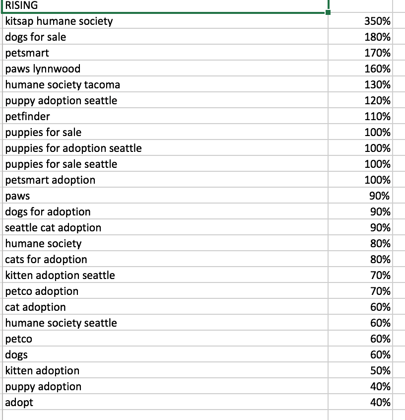
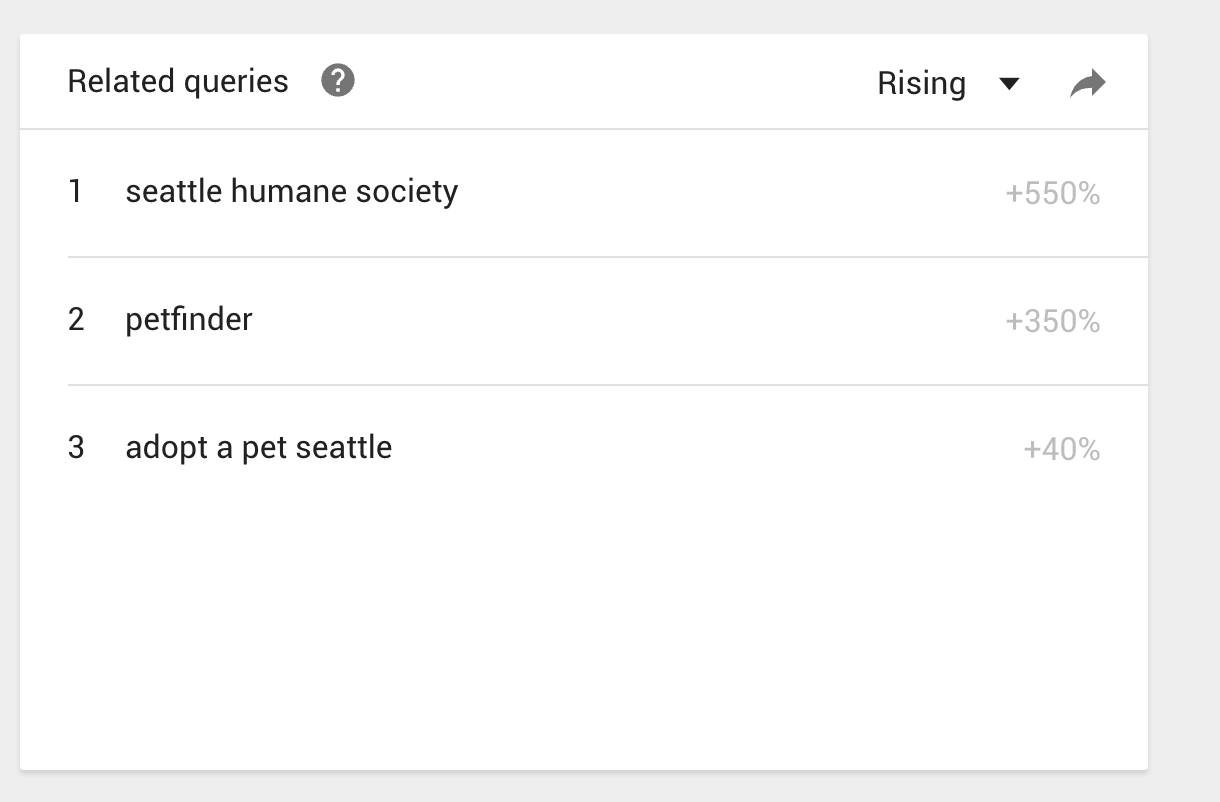
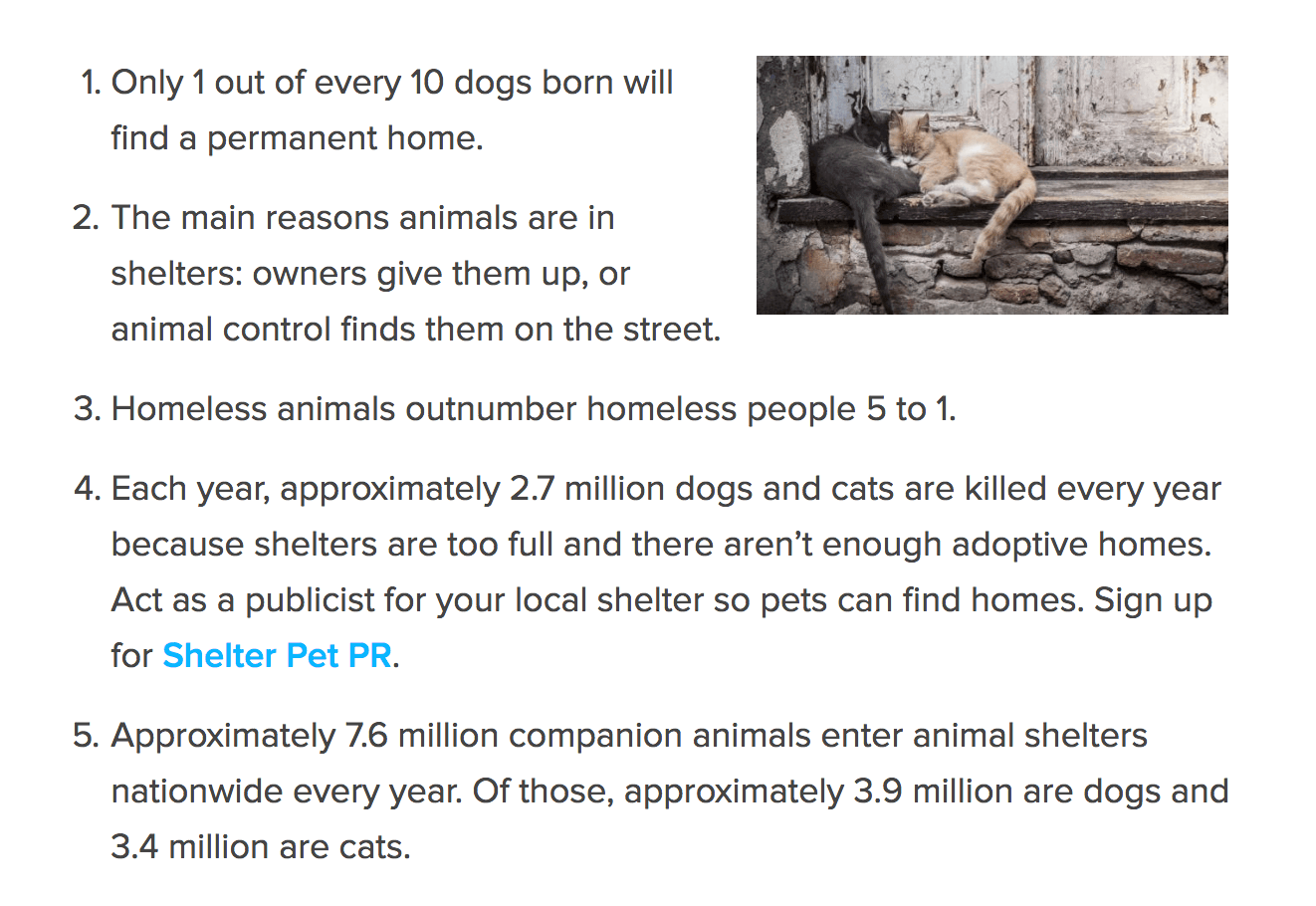
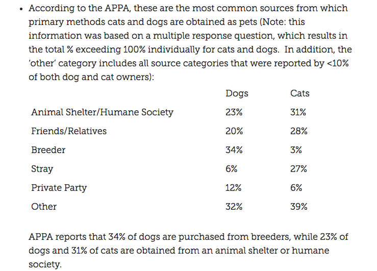
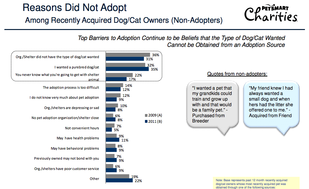
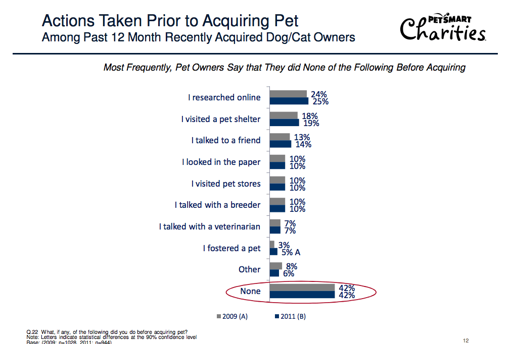
According to the compiled data, there is a large increase in adoption rates in my local area and across the country.
Whether these adoption shelters can accept that incoming capacity is unknown. Gauging from the existing websites and app ecosystems, it seems they are a ways behind in terms of adopting technology. Our main goal is to provide the means for both pet adoption shelters and individuals to connect easier, quicker and faster.
RESEARCH DATA
- According to the American Society for the Prevention of Cruelty to Animals, approximately 1.5 million shelter animals are euthanized every year, with approximately 2.6 million in 2011
- Seattle “Dogs for Sale” Search on Google Trends
- Google Searches Google Trends - Seattle, WA / Tacoma - “Pet Adoption” Trends
- Huge rises in breed popularities
- Lots of specific uncommon breed queries – A breeder search option is critical
- Millenials are the largest pet owning group according to 2017-2018 APPA National Pet Owners Survey
The main data reference while building Dog Dash, was a study on pet adoption research commissioned by PetSmart (provided by Ipsos Marketing). The provided research to “conduct an attitude, usage and barriers research study in order to understand and quantify current awareness and preceptions of both pet adoptions and spaying/neuturing of pets, as well as to understand current barriers to using adoption and spay/neuter programs.”
Traditionally, pet owners can find a cat or dog from most reputable shelters available through a number of online services.
We aimed to include more than the current competitor offerings, providing a unified hub for both shelters and would-be pet owners.
This hub provides a built-in application screening process that ensures quality pet ownership, inherently speeding up the adoption process for both parties. With these improvements, we hope to further legitimize pet adoption.
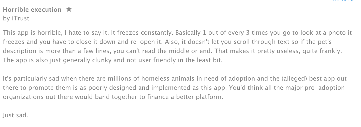
Through some in-depth competitor research research, it appears many users share the same thoughts about the current state of many pet adoption apps. They favor desktop viewing, suffer from clunky, obtrusive user interfaces, and utilize less-than-optimal search filtering options.
Customer Personas
Developing accurate customer personas to accurately guide features and priorities
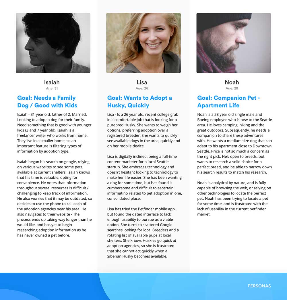
Several user personas were created, each acting as a target user within our millennial age adoption group. These young professionals are highly active online through their laptops and mobile devices. Each had specific requirements for the app, such as:
Needed Features for Users:
- Not user friendly
- Not viewable on mobile
- Search feels clunky – hard to sort multiple results instantaneously on mobile devices
- Unstable – Crashes too frequently to be used
Needed Features for Shelters:
- User profiles - to screen applicants
- Adoption Validation
- Take / Upload Photos
- Upload Pet Profiles / Photos for Adoption
- Accurate Listings / Contact Information
Execution
Idea Mapping / Brainstorming / Customer Journeys
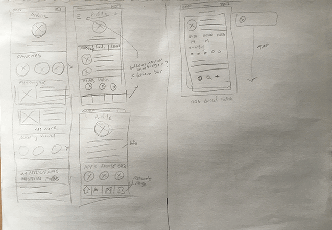
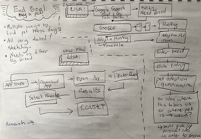
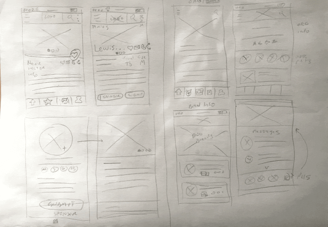
Determining the priority features was the first step before diving into loose, hand-drawn wireframes. We looked closely at our research and user personas to guide the direction of our initial wireframes and customer journeys. In the process of wireframing / sketching, we were able to discover the potential pain points, and how we can engineer a clearer path to the user’s ultimate goal.
Wireframes and Customer Journeys
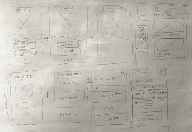
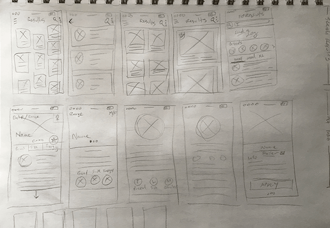
To hit the ground running, we spent a considerable amount of time sketching out detailed wireframes. This was the fastest way to knock out ideas, map out journeys before spending the majority of the time tweaking visual concepts.
At the paper sketching phase, we built a loose sitemap to get a sense of the needed screens, user flow and potential pain points. Combining these flows with our initial research, competitor pain points and sketches, we quickly moved onto prototyping with Invision and Principle. This first prototype is built to gauge interest in the app, acting as a loose yet functional iteration of the final product. We hoped this could provide a meaningful representation of how we can make a difference in the pet adoption market.
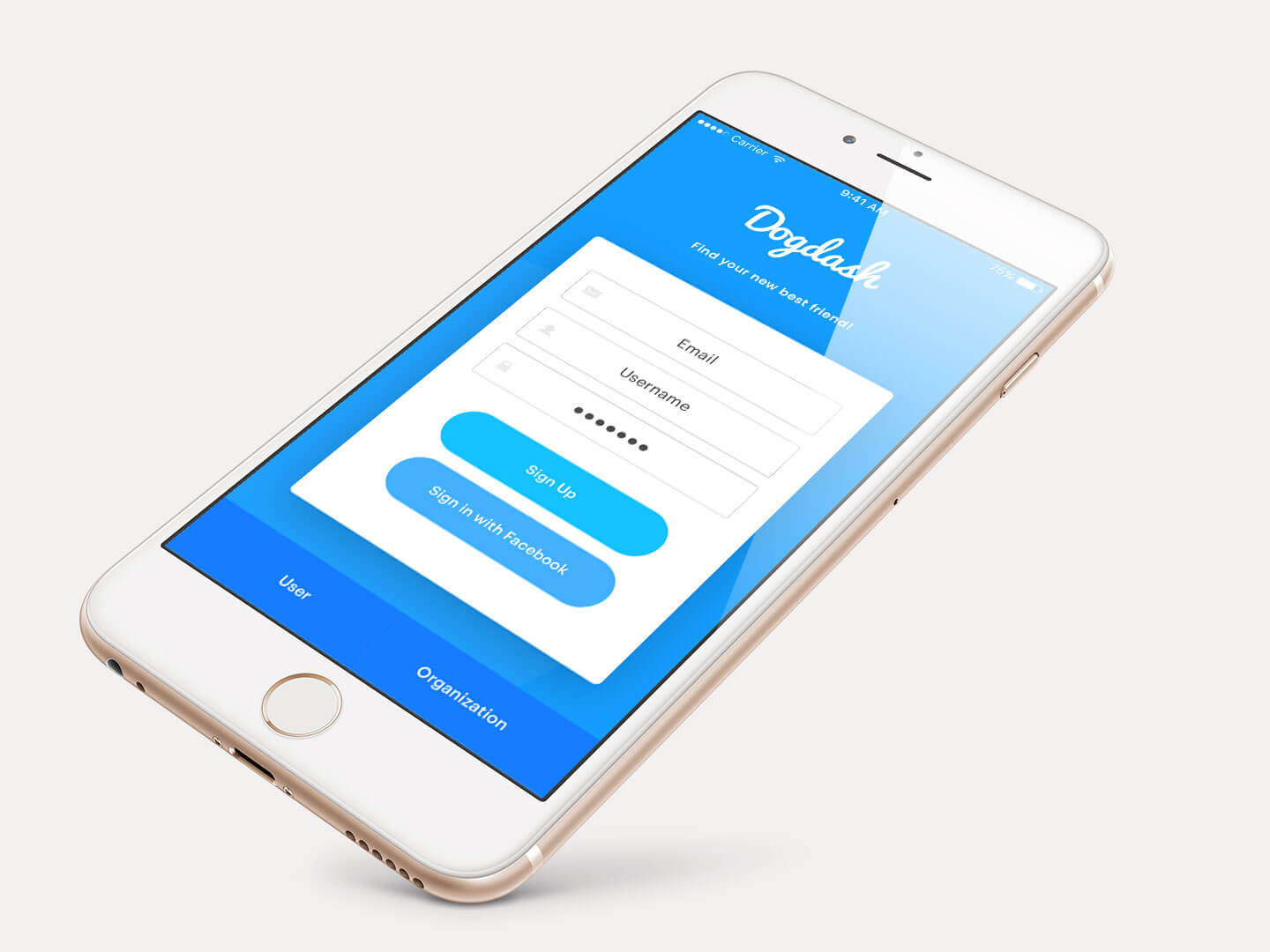
The main screens of the app were designed with easy navigation in mind for each of the two main, customer facing sides of the application. The app would consist the user side for those looking to adopt, and the organization side for those housing pets for adoption. While similar in visual aesthetic, both featured entirely different features, with different priorities.

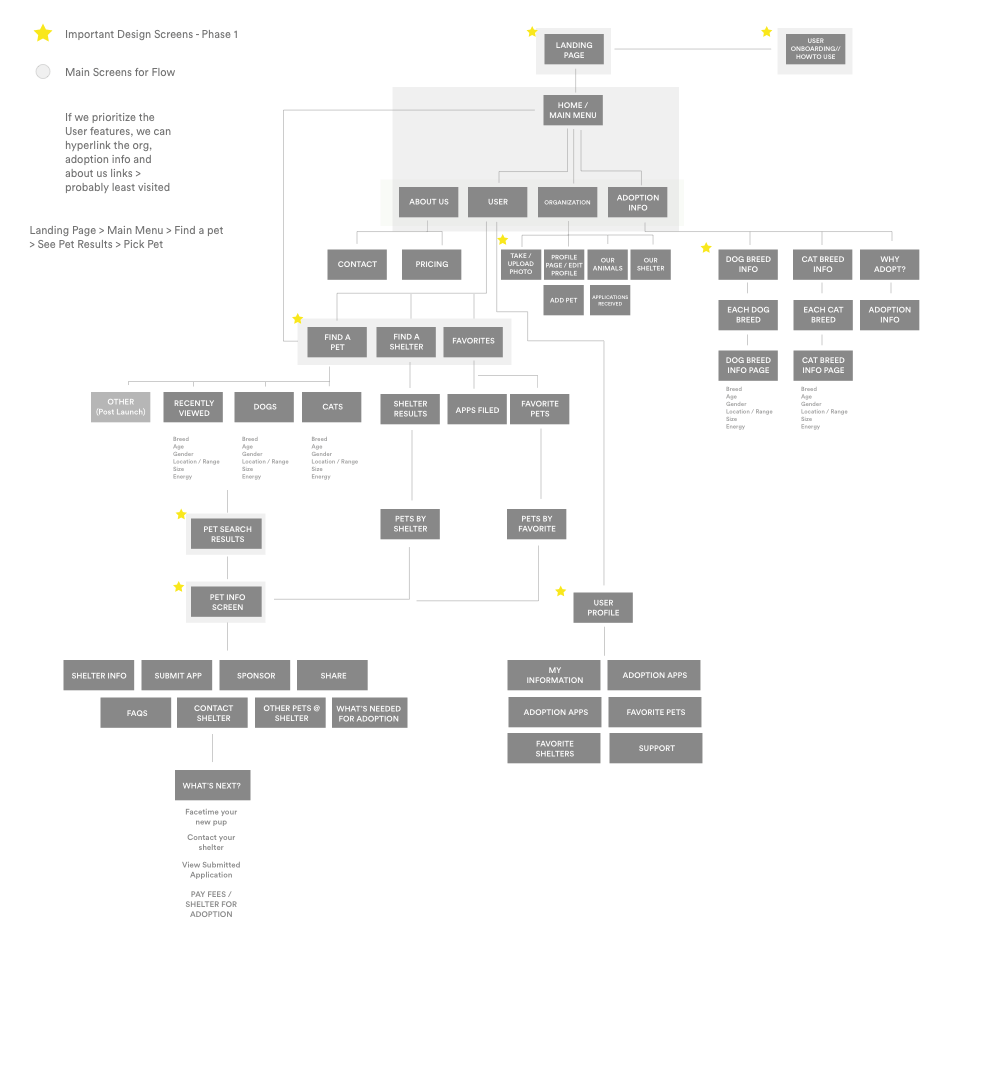
Architecture
Onboarding:
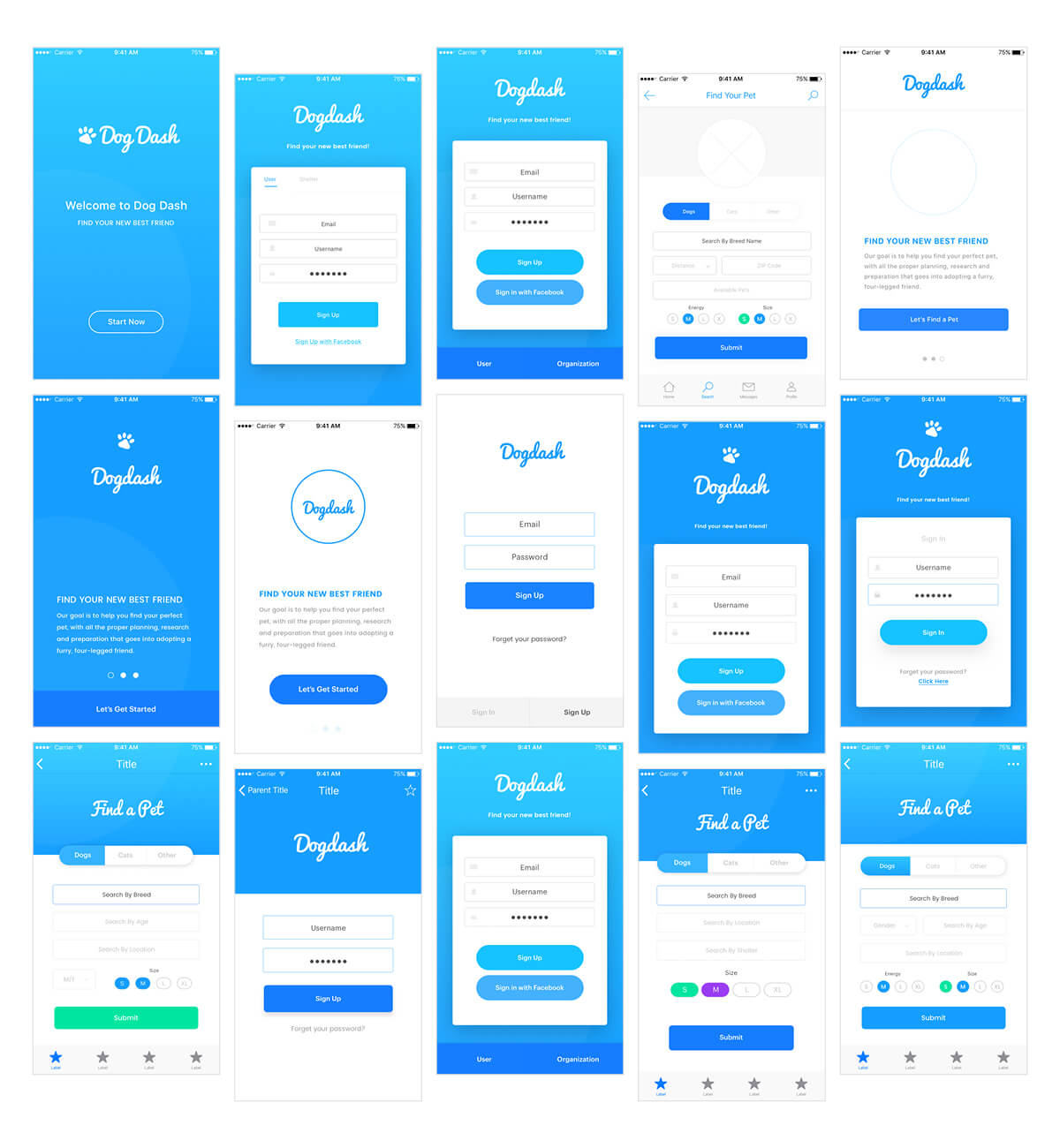
We found it necessary for users to search and filter for pets without needing to sign up. In the case of applying for pets, and shelters uploading a profile / library of adoptable pets, the user has the ability to authenticate with their Gmail or Facebook accounts, in addition to the traditional username / password process.
Search:
Filtering information for quantity and quality results – the best of both worlds. We also thought it would be important to easily return to this screen as it will be the primary app screen. The home page includes the main search option, whereas the secondary search button maintains the initial search. We felt including both in the same button had the ability to reset the search, deleting most of the user filled information - a painful user experience.
Search Results:
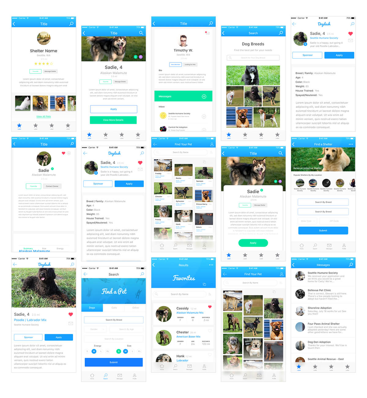
View and analyze multiple results at a time is a major priority, currently a significant pain point of competitors. Option to switch to card view for search results. The main purpose was to quickly scan many results quickly.
Another feature of other apps that becomes distracting in the user experience, is catchy sales titles in the pet name section, the most prominent area of the app. Our goal was to eliminate this in favor of a clean, uncluttered interface. We also thought including the ability to upload photos taken directly from a mobile device could create a more unified experience, eliminating many of the poorly-cropped, or improperly scaled aspect ratios.
We decided to stick to a tried a true, top-to-bottom method of organization. We wanted to include any personal information above the fold, following modular drawers to contain each of the more detailed information. We thought this could keep this information architecture lean, and unobtrusive.
Visual Identity
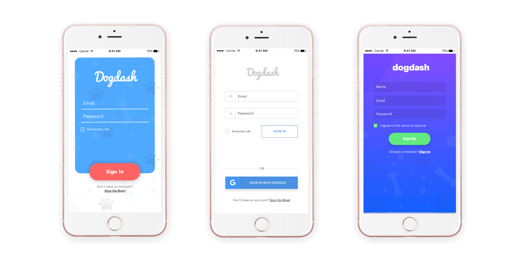
Rejected Screens
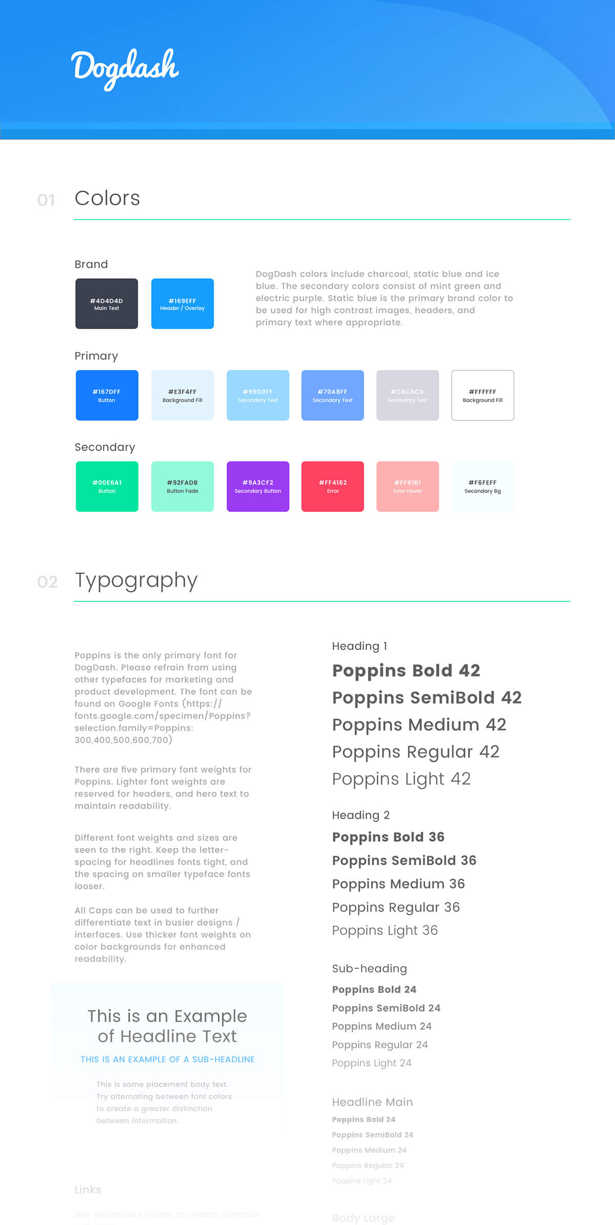
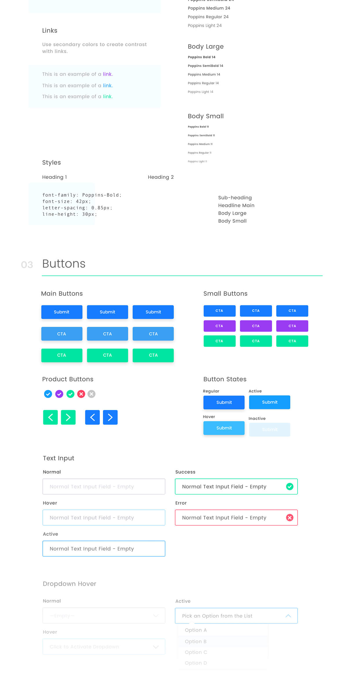
The brand and app was built to convey accessibility across wide range of ages, prioritizing the user experience, a common pitfall of other competitors. Initially, we were a bit in left field with the original style. It included heavy use of tertiary brand colors and the brand font, “Poppins”. We thought this was too far a departure from the intended iOS Human interface guidelines. We decided to backpocket this concepts in favor something more conservative.
Final Product:
After several rounds of iterations and explorations, I arrived at a final concept I felt adequately could serve the end-user to find a suitable pet for his or her lifestyle. I passed the finalized designs in front of users looking to find a pet to grab feedback. After some minor tweaks to navigation and the sitemap, I began prototyping to grab further user feedback.
CONCLUSION
Back in my glory days, at the tender of 6 years old, my entire room was decorated with dog curtains, framed pictures, and collection of stuffed animals. I’ve always been adamant about animal rights. The coupling of design and technology can create a catalyst for good under the right circumstances.
This is a still an ongoing passion project of mine. I have learned a lot creating my own app from conception, and realize how much consideration goes into each detail gathering user research / A/B testing screen iterations with users to better guide a working prototype. We hope to release a working prototype of the app soon.
What's Next
If you'd like to chat about an upcoming project or just want nerd out on the latest design technologies, drop me a at [email protected]. I'm currently AVAILABLE for research and strategy, user experience, user interface design, and product management opportunities. Let's build something incredible.
Designed and Developed by Corey Mines 👨🏻💻
