CASE STUDIES
BOOTH HEALTHCARE
Brand overhaul for a Seattle-based healthcare technology company.
BACKGROUND
Enhancing the customer experience and brand recognition of an early-stage healthcare technology startup
This was an ad campaign and website concept we put together at Lightboard for a Seattle based health-related technology company, providing data-driven health monitoring for individuals with most iOS and Android devices. The existing branding was relatively early stage. With a strong sense of typography and color, we chose to build off these existing concepts, providing a fresh take on a successful website.
DISCOVERY
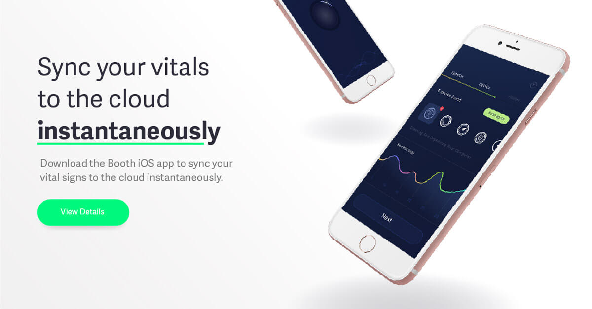
We did some initial work for a set of display ads, acting as a loose discovery session. This gave us the chance to offer possible directions to create a deeper and replicable style for future iterations. We provided several concepts aligned with provided direction, and company goals. It was requested we convey both a healthy life style enabled through detailed health monitoring as well as the product and application.
Initial Exploration
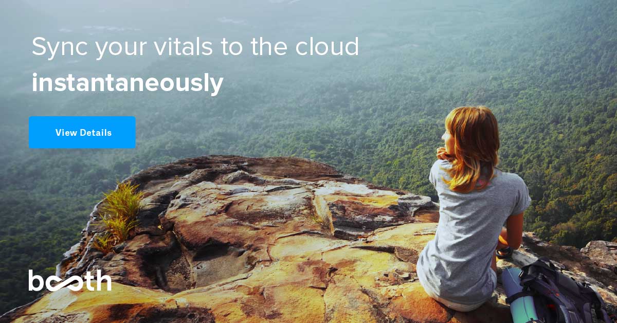
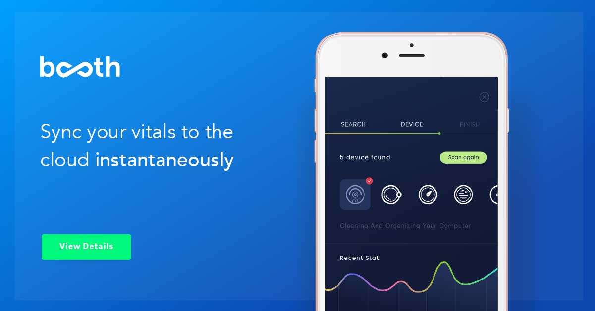
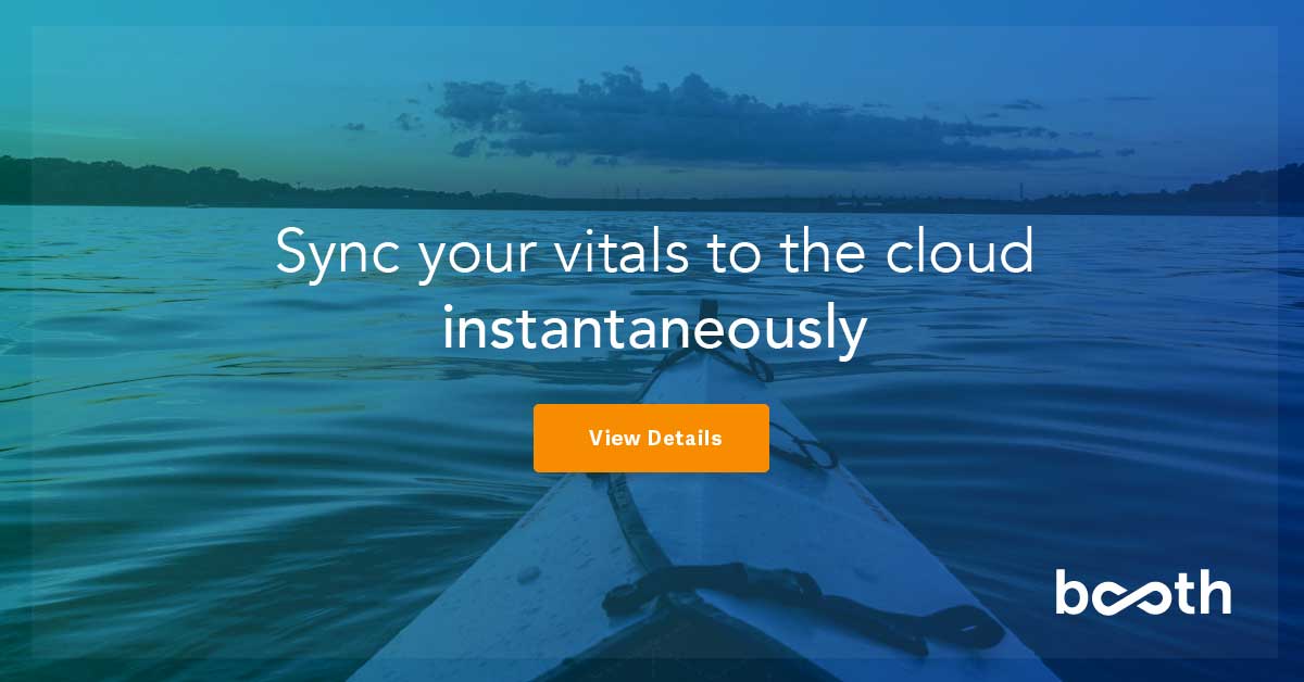
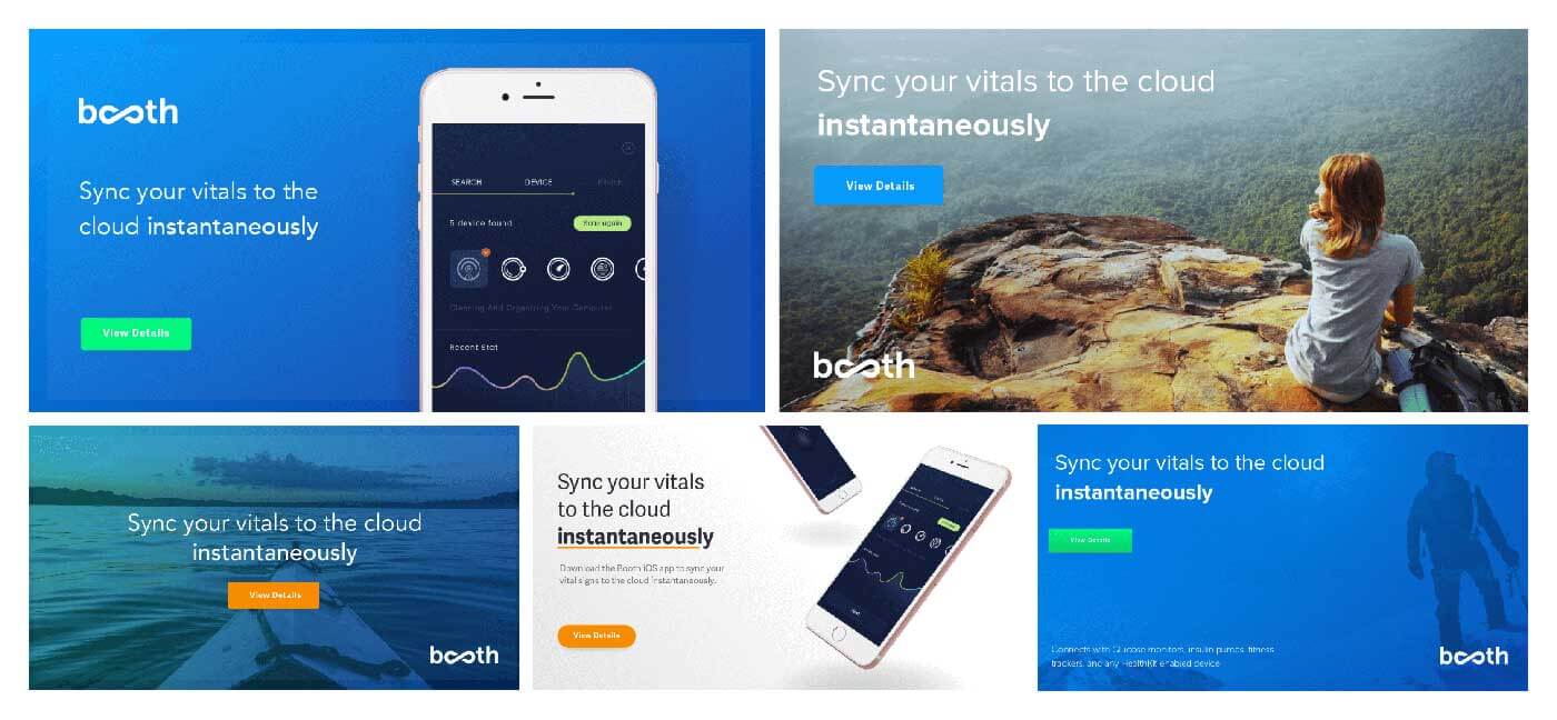
The concepts were well received, offering great insight into further explorations of both the device and outdoor concepts. For the next steps, we expanded upon these concepts utilizing more of the Booth color palette, as well as an outdoor, branded ad campaign concept.
Ad Units
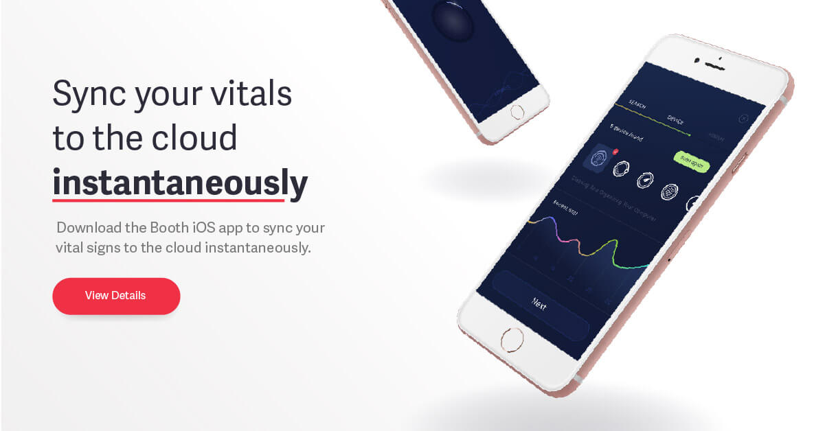
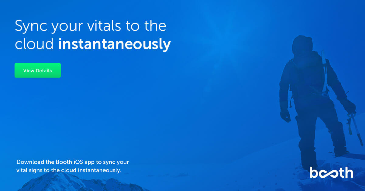
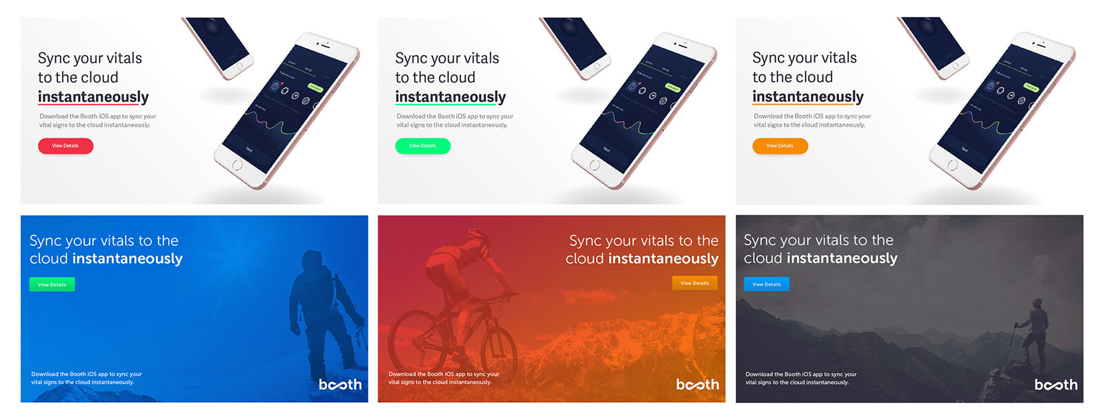
We found the continuity between outdoor scenes created and effective composition together, as well as individually. These extreme circumstantial outdoor shots we provided were not likely scenario for the target market, and implied intimidation rather than motivation. While these concepts were well received, there was more inclination to include both more of the app UI to give people a sense of the actual product.
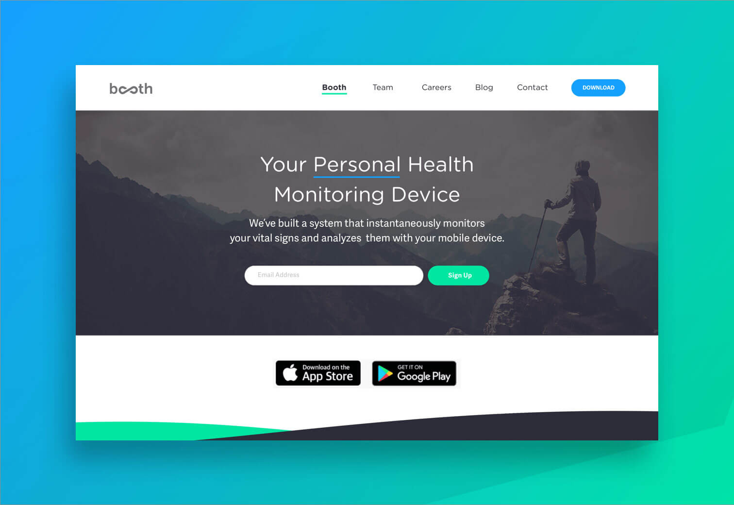
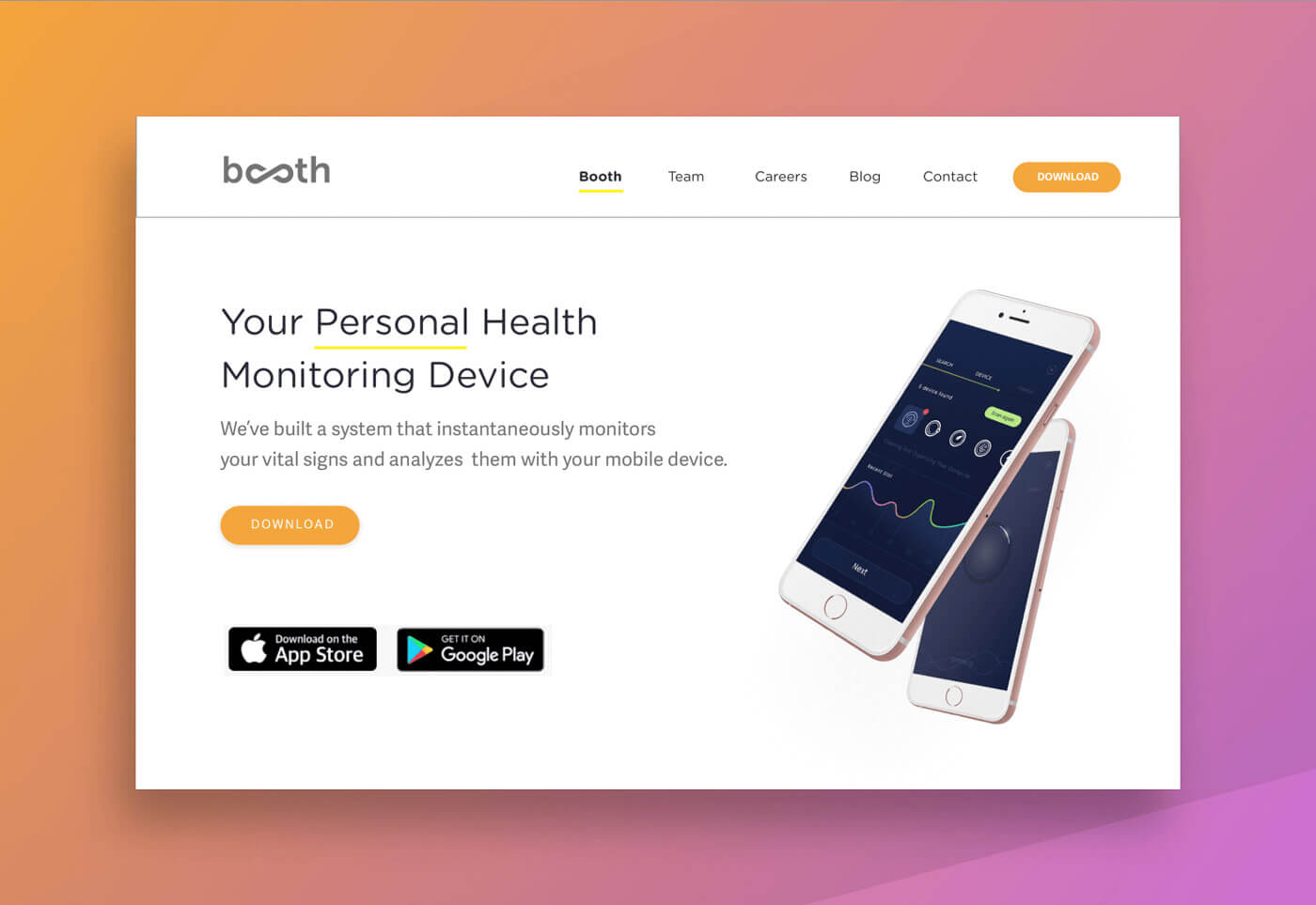
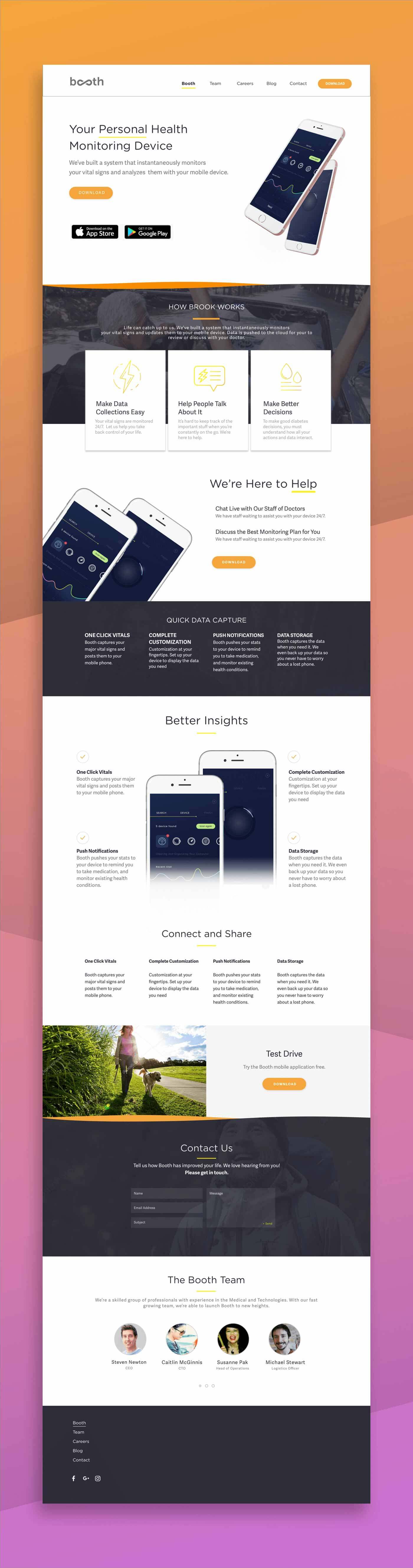
WEBSITE
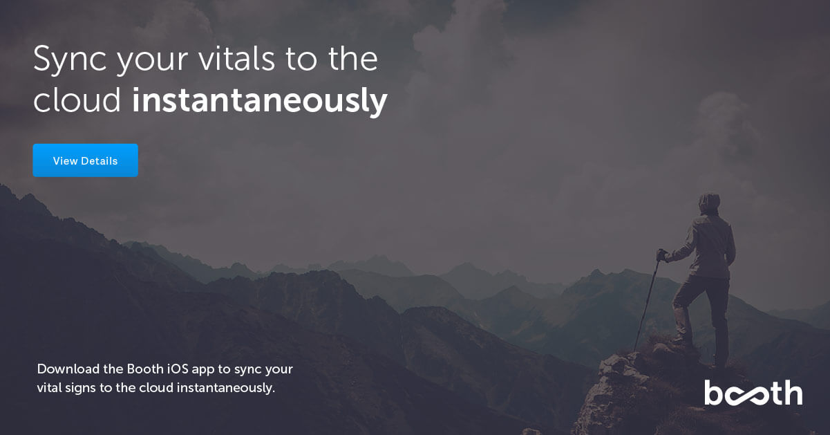
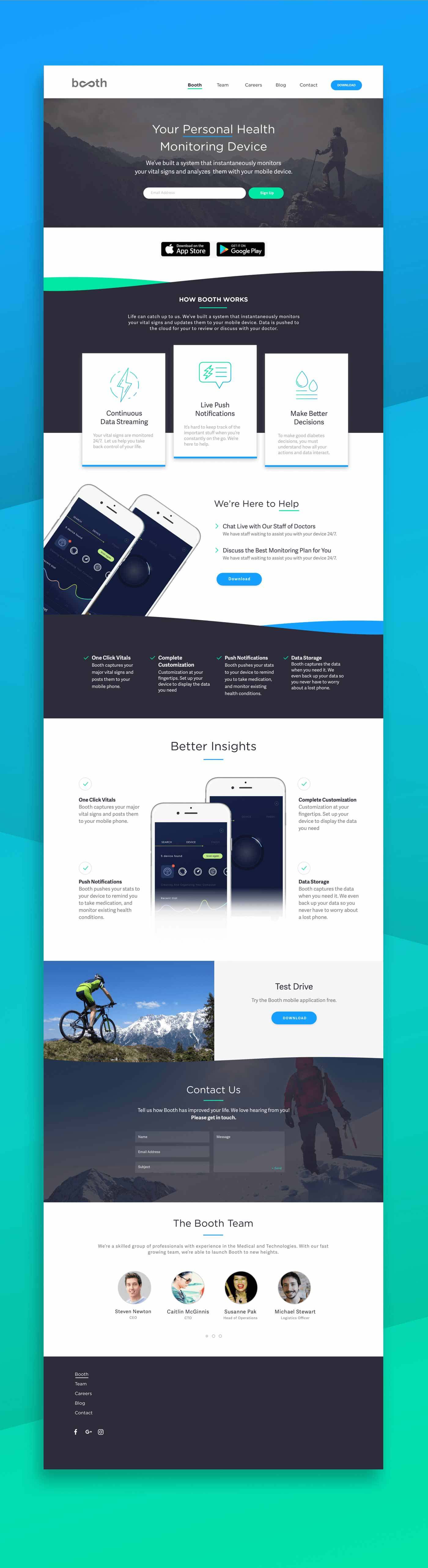
The device mockups concepts were eventually finalized, offering us stronger insight into future iterations and collateral built from this approved style. This visual style was carried over into a landing page redesign, acting as an expansion of our initial discoveries. We followed close criteria and outlined copy provided by the team over at Booth, providing site explorations, as well as full page redesigns for use future marketing efforts.
What's Next
If you'd like to chat about an upcoming project or just want nerd out on the latest design technologies, drop me a at [email protected]. I'm currently AVAILABLE for research and strategy, user experience, user interface design, and product management opportunities. Let's build something incredible.